
Responsive Website Tester with Mobile Simulator
Test your website’s responsiveness across multiple devices instantly. Use our free online mobile simulator to preview your site on iPhones, Androids, and tablets securely.Use now Responsive Website Tester

Table of Contents
Built a layout that looks fine on your monitor but you are not sure about phones and tablets? Load a URL and preview it across common device widths, so you can spot where things break before a visitor does. Quicker than resizing your browser window and guessing at the breakpoints.
📱 Responsive Studio Pro
| Device | Category | CSS width | CSS height | DPR |
|---|
The Responsive Website Tester executes mathematically precise CSS transforms to simulate high-resolution hardware dimensions on limited physical screens.
Initiate multiple sandboxed rendering engines simultaneously to debug cascading style sheets across conflicting media queries in real-time.
This toolkit relies entirely on the local browser document object model, allowing frontend developers to inspect localhost URLs without external server proxying.
Enter your production domain or local development server address into the primary input vector.
Select a predefined hardware breakpoint or manually assign custom pixel boundaries for the viewport.
Observe the CSS layout shifts and JavaScript DOM mutations as the layout scales dynamically.
Activate the split-screen mode to compare structural integrity between mobile and desktop configurations simultaneously.
Last updated: July 2026
🔴 Five checks, one screen
The studio is built around the five things you actually do when checking a layout. The Live Preview tab renders a page at real device widths, either from a URL or from HTML you paste in. The Breakpoint Inspector lets you drag a width slider and see exactly which CSS breakpoint is active at any pixel value. The Viewport Meta Checker reads your page head and tells you whether the one tag that controls mobile rendering is set correctly. The Screenshot Export turns your pasted layout into a PNG you can drop into a ticket or a review. And the Device Reference is a quick lookup for the CSS widths and pixel ratios of common phones, tablets, and laptops.
🟡 A real workflow, start to finish
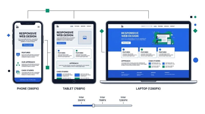
Say a client says your page “looks off” on their phone but fine on your monitor. Start in Live Preview: paste your page’s HTML, or load the URL if the site allows framing, and switch to a phone size like 390 wide. Input a 390 px viewport; output is the page exactly as a modern iPhone would lay it out, so the broken spot is visible immediately. Now open the Breakpoint Inspector and drag the slider to 390. It highlights which framework breakpoint is active there, and if you paste your CSS it lists your own media-query widths and marks which ones apply. Nine times out of ten the bug is a layout rule that only kicks in above a breakpoint your phone never reaches.
Before you blame the CSS, check the Viewport Meta tab. Paste your page head; if the viewport tag is missing or set to a fixed width, the phone is rendering at desktop width and zooming out, which looks exactly like a responsive bug but is a one-line fix. Once it looks right, use Screenshot Export to capture the corrected layout at that device size and attach it to your reply. If the fix touches page weight or layout shift, run the result through the PageSpeed Code Analyzer, and if you want to edit the markup live rather than just preview it, the Offline HTML Editor is the companion tool.
🟢 What browser testing cannot do
Being clear about the edges saves frustration. A browser preview is an accurate size simulation, not a real device: it will not reproduce a specific phone’s fonts, its touch behaviour, or a quirk in one manufacturer’s browser. For final sign-off on a critical page, a real handset still matters.
- 🔵 Some URLs will not load. Many large sites send an X-Frame-Options or CSP rule that blocks being shown inside another page. If the URL preview stays blank, that is the site refusing to be framed, not a fault in the tool. Paste the page’s HTML instead and it will always render.
- 🟠 Screenshots suit self-contained code. Capture works by rasterising your pasted HTML in the browser. External images without CORS permission and cross-origin URLs cannot be turned into an image locally, which is a browser security limit, not a bug.
- 🟣 Sizes are CSS pixels, not raw pixels. The widths shown are the values your media queries respond to. A device with a pixel ratio of 3 has three times as many physical pixels, which the Device Reference tab lays out for you.
If you want the reasoning underneath all of this, why one meta tag decides mobile rendering, how CSS pixels differ from device pixels, and how breakpoints and fluid units actually work, it is covered in the companion guide on how responsive web design works
Why is my URL preview blank?
That site blocks being shown inside another page with an X-Frame-Options or CSP rule. It is a server setting, not a fault here. Switch to Paste Code mode, which always renders.
Is this the same as testing on a real phone?
It is an accurate size and layout simulation, which catches most responsive bugs early. For final sign-off, a real device still matters for fonts, touch, and browser quirks.
Does my code or URL get uploaded?
No. Everything runs in your browser tab. Pasted code and typed URLs stay on your device, so you can test private or unreleased pages safely.
What width should I test first?
Start around 390px, a common modern phone. Then check a tablet near 768px and a laptop near 1280px. Those three widths surface most layout breakage.
Why does the screenshot sometimes fail?
The browser cannot rasterise external or cross-origin images for security reasons. Screenshots work best with self-contained HTML and inline CSS.
What is device pixel ratio (DPR)?
It is how many physical pixels sit in one CSS pixel. A DPR of 3 means a 390px-wide phone actually has 1170 hardware pixels. Your CSS responds to the 390.
Can it show all devices at once?
Yes. The Live Preview tab has an “All devices” view that renders the page across every listed size in a grid, plus a two-up compare mode.
How do I know which breakpoint is active?
Open the Breakpoint Inspector and drag the width slider. It highlights the active Tailwind and Bootstrap breakpoint, and parses any breakpoints in your own pasted CSS.