Why One Page Fits Every Screen
A single HTML page can look right on a 390px phone and a 2560px monitor because of a small set of ideas working together: one meta tag, a unit system built on CSS pixels, breakpoints, and fluid sizing. How Responsive Web Design each piece works and how they fit into a real build.
Table of Contents
Last updated: July 2026
🔴 The one tag that starts it all
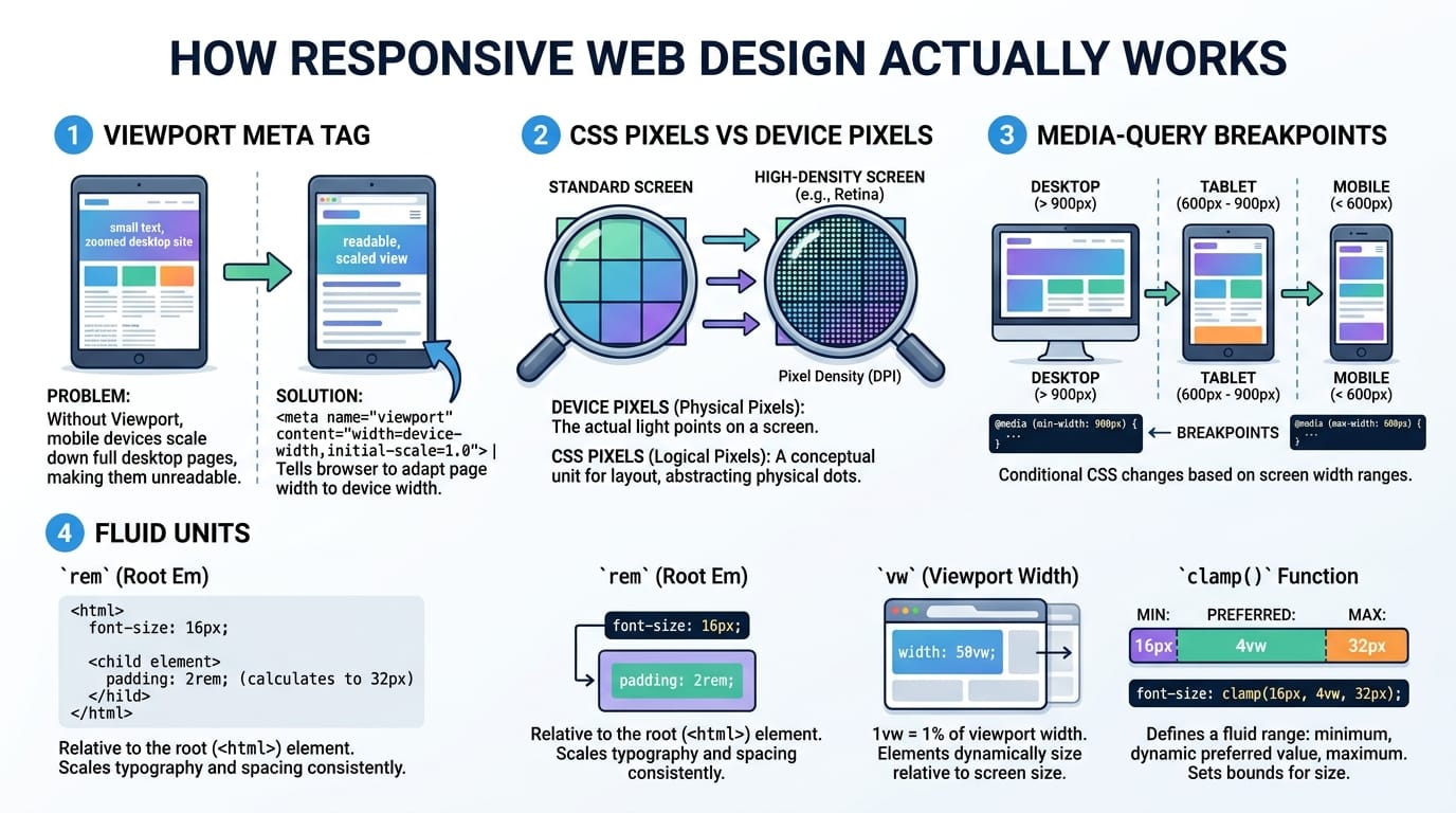
Before any CSS matters, a mobile browser has to be told how wide the page should be. Left to its own devices, a phone assumes a page was designed for a desktop, renders it at roughly 980 pixels wide, and zooms the whole thing out so it fits. That is why an un-optimised site looks like a tiny, unreadable desktop page on a phone. The fix is a single line in the head: the viewport meta tag with content set to width=device-width, initial-scale=1. It tells the browser to use the real screen width as the layout width, and to start at normal zoom. Without it, no amount of clever CSS will make a page truly responsive, which is why it is the first thing worth checking.
🟡 CSS pixels, device pixels, and why 390 is7not 1170
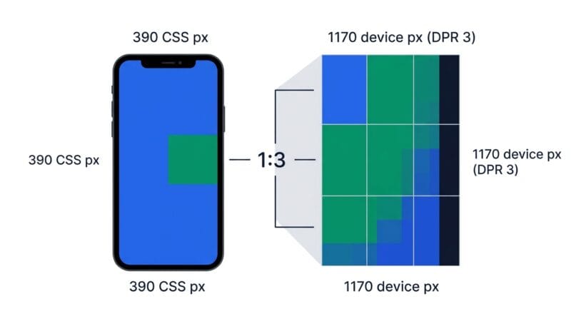
Here is the idea that trips up most people. When you write a media query for 390 pixels, you are not talking about the phone’s physical pixels. Modern screens pack many tiny hardware pixels into the space of one logical pixel so that text stays sharp. The ratio between them is the device pixel ratio, or DPR. A phone with a DPR of 3 has 1170 physical pixels across, but it reports itself as 390 CSS pixels wide, and CSS pixels are what your layout responds to. This is why a design reference should always use CSS widths, and why a device with a huge megapixel screen can still be a “small” 390px layout target. Getting this distinction right is the difference between a layout that behaves predictably and one that seems mysteriously off.
🟢 Breakpoints and the mobile-first habit
A breakpoint is simply a width at which your layout changes, expressed as a CSS media query. You might stack cards in a single column on narrow screens and switch to three columns once there is room. Frameworks ship common sets of these widths, and knowing them helps: Tailwind uses 640, 768, 1024, 1280 and 1536, while Bootstrap uses 576, 768, 992, 1200 and 1400. The professional habit is to write mobile-first, meaning your base styles target the smallest screen and each media query uses min-width to add complexity as the screen grows. This keeps the simplest experience as the default and layers on enhancements, rather than building a desktop page and fighting to squeeze it down.
🔴 Fluid layouts: the units that stretch
Breakpoints handle the big jumps, but the space between them is handled by fluid units. Percentages size an element relative to its container. The rem unit sizes things relative to the root font size, which keeps a layout in proportion and respects a user’s font settings. Viewport units like vw and vh are a share of the screen itself. The modern glue is clamp(), which lets a value grow with the screen but stops at a sensible minimum and maximum, so a heading can scale smoothly without ever becoming tiny or gigantic. A newer addition, container queries, lets a component respond to the width of its own container rather than the whole page, which makes truly reusable components possible. Together these mean a good layout flexes continuously, and breakpoints only step in for the larger structural changes.
🟡 Where testing fits, and why local testing stays private
All of this theory only pays off if you can see it working, which is why testing sits between building and shipping. The practical loop is to write mobile-first CSS, preview it at a few real widths, drag through your breakpoints to confirm the switches happen where you intended, verify the viewport tag, and only then hand off. Doing that in the browser has a quiet privacy benefit: your markup and any URLs you check never leave your machine, so unreleased pages and client work stay confidential. That client-side approach is the same principle behind keeping data on the device rather than a server, which our note on client-side data processing covers in more depth.
When you are ready to try it, the Responsive Studio puts device preview, a breakpoint inspector and a viewport checker in one place. For the layout mechanics behind the visuals, the guide on HTML image and grid layouts pairs well, and if you are assembling a wider toolkit, our roundup of offline web developer tools is a good next stop.
What makes a website responsive?
A viewport meta tag, a layout built in CSS pixels, media-query breakpoints, and fluid units. Together they let one page adapt from a narrow phone to a wide monitor without a separate mobile site.
Do I still need the viewport meta tag?
Yes, always. Without it a phone renders your page at desktop width and zooms out. The standard tag is width=device-width, initial-scale=1.
Why is my 390px phone really 1170 pixels?
Because of device pixel ratio. The phone packs three physical pixels into each CSS pixel for sharpness, but your CSS responds to the 390 CSS-pixel width, not the 1170 hardware pixels.
What is mobile-first CSS?
You write the small-screen layout as the default, then use min-width media queries to add complexity for larger screens. It keeps the simplest version as the baseline.
When should I use clamp() instead of a breakpoint?
Use clamp() for values that should scale smoothly, like font size or spacing. Use breakpoints for structural changes, like switching a grid from one column to three.
What are container queries?
They let a component respond to the width of its own container rather than the whole viewport, which makes a component reusable in a sidebar or a full-width row without rewriting its rules.
Which breakpoints should I use?
Match your framework, or pick widths that suit your content. Common anchors are around 640-768px for tablets and 1024-1280px for laptops. Test your real content rather than trusting numbers blindly.
How do I check my responsive design?
Preview the page at several widths, drag through your breakpoints, and confirm the viewport tag. The Responsive Studio does all three in the browser.