Free Offline CSS Box Shadow Generator: Master UI Design
Master modern UI depth instantly with our free offline CSS box shadow generator. Create stunning visual hierarchy with zero server latency and total privacy.
Table of Contents
Last updated: June 2026
🔴 CSS box-shadow — Complete Syntax and Multi-Layer Techniques
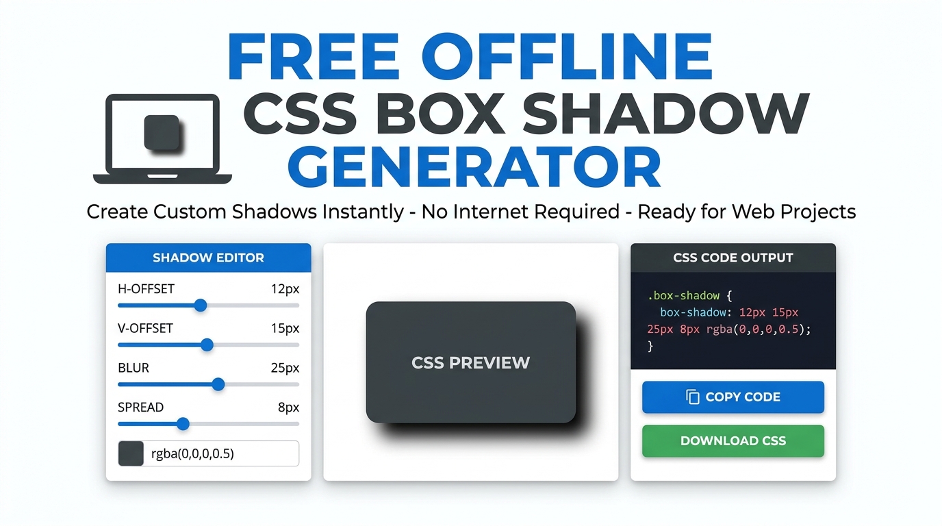
The box-shadow property syntax is: box-shadow: [inset] offset-x offset-y [blur-radius] [spread-radius] color. Every parameter except offset-x and offset-y is optional. Omitting blur-radius gives a hard edge shadow. Omitting spread-radius leaves the shadow the same size as the element. The inset keyword reverses the shadow direction — instead of projecting outward from the element, the shadow draws inside it, creating a pressed-in or recessed appearance.
Multiple shadows stack from the first declaration on top to the last on the bottom. A common two-layer Material Design shadow: box-shadow: 0 1px 3px rgba(0,0,0,0.12), 0 1px 2px rgba(0,0,0,0.24). The first layer is the ambient shadow — soft, diffused, no directional offset. The second is the key shadow — slightly offset in the Y direction to show light source direction. At higher elevation levels, Material Design increases both Y offset and blur radius proportionally while keeping the colour constant. A neumorphic shadow pairs a positive X/Y shadow in a darker tone with a negative X/Y shadow in a lighter tone: box-shadow: 8px 8px 16px #b8bec9, -8px -8px 16px #ffffff — both against a background colour exactly between the two shadow tones.
🟡 CSS Gradients — Linear, Radial, and Conic with Stop Positions
Linear gradients transition colours along a straight axis defined by an angle in degrees. 0deg is bottom-to-top, 90deg is left-to-right, 135deg is top-left to bottom-right. The angle can alternatively be specified as a direction keyword: to right, to bottom right, etc. Colour stops specify where each colour is at full intensity: linear-gradient(90deg, #2563eb 0%, #7c3aed 50%, #ec4899 100%). Without stop positions, stops distribute evenly. Compressing stops — 0%, 10%, 100% — creates a fast colour transition at the start and a slow one across the rest of the element.
Radial gradients emanate from a centre point. radial-gradient(circle, #2563eb, #ec4899) produces an even circular fade. radial-gradient(ellipse at 30% 70%, #2563eb, #ec4899) positions the centre at 30% from the left and 70% from the top. Conic gradients use the conic-gradient(from Ndeg, ...) syntax — colours rotate around the centre point like a colour wheel or pie chart. conic-gradient(red 0deg 90deg, blue 90deg 180deg, green 180deg 270deg, yellow 270deg 360deg) produces four equal quadrants. The from Ndeg sets the starting angle for the first stop. The MDN conic-gradient reference covers edge cases including repeating-conic-gradient() for pattern backgrounds.
🟢 CSS Transform Functions — All Six and When to Use Each
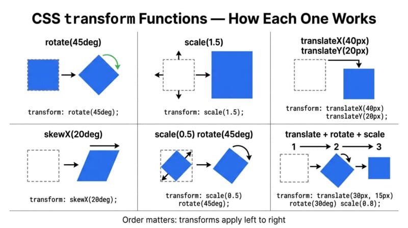
CSS transforms apply to an element without affecting document flow — transformed elements don’t push siblings. All six 2D transform functions can be combined in a single transform property, applied left to right: transform: translateX(50px) rotate(45deg) scale(1.2). Order matters — rotating before translating produces a different result than translating before rotating, because each transform is relative to the current coordinate frame after the previous transforms.
translate(x, y) moves the element from its normal position — useful for hover lift effects and off-screen slide animations. scale(x, y) grows or shrinks the element — values above 1 enlarge, below 1 reduce, 0 collapses to invisible. rotate(deg) spins the element around its transform-origin point (default: centre). skew(x, y) shears the element along its axes — useful for parallelogram shapes and diagonal design elements. skewX(deg) and skewY(deg) apply each axis independently. Transforms trigger GPU compositing in modern browsers — CSS animations using only transform and opacity run on the GPU compositor thread independently of the main JavaScript thread, producing smooth 60fps animation even under JavaScript load. Animating width, height, top, or margin triggers layout recalculation and is significantly more expensive — always prefer transform: translate() over position-based animation.
🟢 CSS filter Property — All Eight Functions
The filter property applies eight visual effect functions to the element’s rendered output. Multiple filters chain in order: filter: blur(2px) brightness(120%) contrast(110%). blur(px) applies a Gaussian blur — larger values produce stronger blurring. brightness(%) adjusts overall lightness — 0% is black, 100% is normal, 200% is twice as bright. contrast(%) expands or compresses the tonal range — 0% is flat grey, 100% is normal, 200% is extreme. saturate(%) boosts or removes colour intensity — 0% is greyscale, 100% is normal. hue-rotate(deg) shifts all hues by the specified degrees around the colour wheel without changing saturation or lightness — 180deg produces the approximate complement. grayscale(%) converts towards greyscale. sepia(%) adds a warm brownish tone. invert(%) reverses lightness values — 100% produces a photographic negative. Filters are applied to the composited element including its background, borders, and content as a unit.
🟡 CSS @keyframes Animations — Syntax, Timing Functions, and Performance
A CSS animation requires two components: a @keyframes rule defining the animation stages and an animation property on the element applying it. The minimum syntax: @keyframes myAnim { from { opacity: 0; } to { opacity: 1; } } with animation: myAnim 0.5s ease forwards;. The from/to keywords are equivalent to 0%/100%. Percentage stops in between define intermediate states: a bounce animation might set 0% { transform: translateY(0) }, 50% { transform: translateY(-20px) }, 100% { transform: translateY(0) }.
The animation shorthand packs six sub-properties: animation: name duration timing-function delay iteration-count direction fill-mode. timing-function controls the speed curve within each keyframe interval — not across the whole animation. ease starts slow, accelerates, then decelerates. ease-in starts slow and accelerates. ease-out starts fast and decelerates — most natural for exit animations. linear maintains constant speed — useful for infinite loops like spinners. fill-mode: forwards keeps the end state of the animation after it completes — without it, the element snaps back to its original styles. fill-mode: backwards applies the start state during the delay period before the animation begins — prevents the element from being visible in its non-animated state during a delay. Use our CSS Visual Studio Pro to generate all 12 animation types with configurable duration and iteration.
🟢 Glassmorphism — The CSS Behind Frosted Glass Cards
Glassmorphism requires three CSS properties working together. backdrop-filter: blur(Npx) blurs the content behind the element — this is the core of the frosted glass effect. background: rgba(R, G, B, alpha) applies a semi-transparent tinted layer over the blur — typically white at 15–25% opacity for light glass, or black at 15–25% for dark glass. border: 1px solid rgba(255,255,255,0.3) adds a subtle edge highlight that makes the glass boundary visible. A soft box-shadow completes the effect: box-shadow: 0 8px 32px rgba(0,0,0,0.1).
The implementation requirement: the parent scene must have visible, complex content behind the glass card for backdrop-filter to have any visible effect. A gradient or image background behind the glass card is the most common approach. The backdrop-filter stacking context also requires the glass element to be in the same stacking context as its background — if the background is on a position: fixed element and the glass card is in normal flow, the backdrop blur may not render correctly in some browser implementations. Performance: backdrop-filter is GPU-accelerated in Chrome and Safari but can be expensive at high blur values (above 20px) on older hardware — test on mid-range mobile devices before using blur values above 15px in production.
- 🔵 animation-will-change: transform — hint the browser to create a GPU compositing layer ahead of time, reducing the first-frame jank on complex animations.
- 🟠 prefers-reduced-motion — always wrap decorative animations in
@media (prefers-reduced-motion: no-preference) { ... }to respect users who have disabled motion in their OS accessibility settings. - 🟣 transform-origin — controls the pivot point for rotate, scale, and skew. Default is
50% 50%(element centre). Settingtransform-origin: top leftmakes scale and rotate use the top-left corner as the fixed point.
Why does transform order matter in CSS?
Each transform function is applied relative to the coordinate frame left by the previous one. translate(50px, 0) rotate(45deg) moves the element 50px right in the original coordinate space then rotates it — the rotation point is 50px from the original position. rotate(45deg) translate(50px, 0) first rotates the coordinate frame 45°, then translates 50px along the now-rotated X axis — the element ends up at a different position. When combining transforms, prototype the sequence in a browser devtools panel to verify the visual result before finalising the order.
What is the difference between opacity and visibility: hidden?
opacity: 0 makes the element invisible but it remains in the layout, receives pointer events, and is accessible to screen readers. visibility: hidden makes the element invisible and removes it from pointer events, but still occupies layout space. display: none removes the element entirely from layout and all interaction. For animations, opacity is preferred — it’s GPU-accelerated and transitions smoothly. visibility cannot transition smoothly but can be combined with opacity in transitions to make a hidden element also non-interactive.
Can I animate clip-path shapes in CSS?
Yes, if both the start and end states use the same type of shape function with the same number of vertices. Animating between two polygon() values works when both have the same number of points — the browser interpolates each vertex coordinate pair. Animating between circle() and polygon() is not supported since the functions are different types. A common pattern is morphing between two polygon shapes: expand a triangle’s vertices outward to a hexagon, or contract a rectangle’s corners to create a star-like inward shape.
What is the performance difference between CSS and JavaScript animations?
CSS animations using only transform and opacity run on the GPU compositor thread in browsers — they are unaffected by JavaScript execution blocking the main thread. JavaScript animations using requestAnimationFrame run on the main thread and can be delayed by heavy JS work. For entrance/exit animations and hover effects, CSS is preferable. For complex choreographed sequences, physics-based animations, or animations driven by scroll position or user input, JavaScript-controlled animations (or the Web Animations API) are more appropriate. The key principle: if you can animate it in CSS with only transform and opacity, do so.
How do I make a gradient that repeats across an element?
Use repeating-linear-gradient() or repeating-radial-gradient(). The syntax is the same as regular gradients but stops without a position repeat at regular intervals. For diagonal stripes: repeating-linear-gradient(45deg, transparent, transparent 10px, rgba(0,0,0,0.1) 10px, rgba(0,0,0,0.1) 20px) — transparent for 10px, then semi-transparent for the next 10px, then repeating. Adjusting the stop positions changes stripe width. Adjusting the angle changes the stripe direction. This technique requires no images and scales perfectly at all resolutions.
What does hue-rotate actually do to a colour?
filter: hue-rotate(Ndeg) shifts every colour in the element by N degrees around the HSL colour wheel. A 180° rotation produces approximate complementary colours — blues shift toward orange, reds shift toward cyan. A 90° rotation shifts yellow toward green, cyan toward blue. Unlike saturate() or brightness(), hue-rotate changes which colour appears rather than how much of it there is. It works uniformly on images, backgrounds, borders, and text within the filtered element. It’s useful for creating colour theme variants from a single asset without generating multiple files.
Can I use box-shadow to create borders without affecting layout?
Yes. box-shadow: 0 0 0 3px #2563eb creates a 3px solid border using a spread-only shadow with no offset or blur. Unlike CSS border, this shadow doesn’t affect the element’s size or layout — the element’s box model is unchanged. Use spread-only shadows when you need an animated border (border properties can’t interpolate between no-border and a border without a size jump), when adding borders to images with box-sizing: border-box would affect dimensions, or when layering multiple border colours at different distances using multiple comma-separated shadow layers.
What is animation fill-mode and why does it matter?
animation-fill-mode controls what CSS values apply outside the animation’s active period. none (default): the element uses its normal styles before and after the animation. forwards: the element retains the final keyframe styles after the animation ends — essential for entrance animations where you want the element to stay visible at full opacity. backwards: the element applies the first keyframe styles during the animation delay period — prevents a flash of the non-animated state before a delayed animation starts. both: applies both forwards and backwards behaviour simultaneously.
Does backdrop-filter work in all browsers?
backdrop-filter is supported in Chrome 76+, Safari 9+ (with -webkit-backdrop-filter prefix), and Firefox 103+. The generated CSS includes both -webkit-backdrop-filter and the unprefixed version. For Firefox versions below 103, backdrop-filter renders as a no-op and the glass card appears with only its semi-transparent background — the blur effect is missing but the card remains usable. Use @supports (backdrop-filter: blur(1px)) { ... } to apply enhanced glass styles only when the property is supported, with a solid fallback background for unsupported browsers.