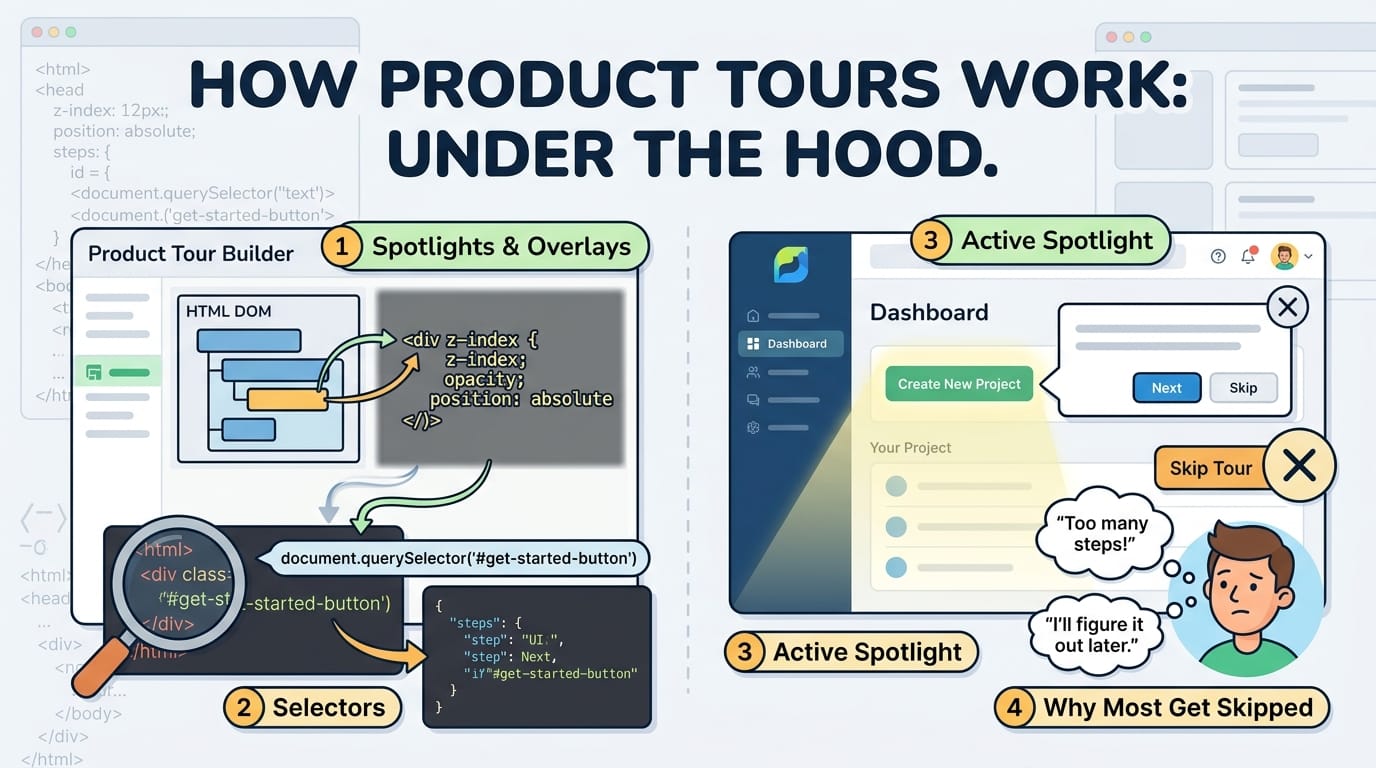
Spotlights, Selectors and Why Most Get Skipped
The box-shadow trick behind every spotlight overlay, why selectors break silently, and what onboarding research says about the tours people actually finish.
Table of Contents
Last Updated: August 2026
🔴 Locating an Element on a Live Page
Before anything can be highlighted, the tour has to know where the target is. That sounds trivial and is where most of the complexity actually lives.
Coordinates are relative to the window, not the page
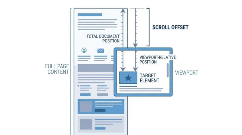
The browser will tell you an element’s position through getBoundingClientRect, which returns top, left, width and height. The catch is that those numbers are measured from the top-left of the viewport, not the document. Scroll down 400 pixels and the same element reports a top value 400 lower than before.
An overlay positioned absolutely within the page needs document coordinates, so the scroll offset has to be added back:
var top = rect.top + window.pageYOffset;
Miss that line and the tour works perfectly at the top of the page and drifts further out of alignment the further down you go. It is a common enough bug that it is worth recognising the symptom.
The measurement goes stale immediately
A rectangle is a snapshot. The moment it is taken it can be wrong, because pages move constantly: the user scrolls, the window resizes, a font finishes loading and reflows the text, an image arrives and pushes everything down, a sidebar animates open.
Any tour that measures once and never again will slowly slide off its target. The fix is to re-measure on scroll and resize, and this is also why a spotlight that animates smoothly between steps looks so much better than one that jumps — a CSS transition on the position properties covers the gap between one measurement and the next.
Keeping the tooltip on screen
A bubble placed to the right of an element is fine until that element sits near the right edge, at which point half the text is off screen. Every usable tour implementation therefore clamps the bubble back inside the viewport after positioning it, and often flips it to the opposite side entirely when there is no room.
This is overwhelmingly a mobile problem. At 380 pixels there is no such thing as “to the right of” anything, so a tour written on a desktop and never tested narrow will place bubbles off screen on the devices most of its users are holding. The wider question of how layouts behave across widths is covered in how responsive web design works.
🟡 The Selector Problem
Everything above assumes the tour found the element. That assumption is where tours break in production, and it breaks in a way that produces no error at all.
Failing quietly
Ask the browser for an element that does not exist and it does not throw. It returns null, calmly, and the tour code has to decide what to do. Skip the step and the user never learns the thing you meant to teach them. Stop the tour and it appears broken. Either way nothing is logged, nothing turns red, and the first sign of trouble is a support message weeks later.
Compare that with a broken link, which returns a 404 that somebody’s monitoring will eventually catch. A broken tour step has no equivalent. It just quietly stops teaching.
Matching too much
The subtler failure is a selector matching several elements. Standard behaviour is to take the first, which on a page of repeated cards means the tour highlights the top one rather than the one you had in mind. Nothing errors here either — the tour runs, points at the wrong thing, and reads as confusing rather than broken.
Why classes are the wrong hook
Class names exist to style things. They get renamed, merged and dropped whenever the design changes, and the person doing that has no idea a tour depends on them. Utility-first CSS makes this worse, because a class list like px-4 py-2 rounded bg-blue-600 describes appearance only and changes every time the appearance does.
A dedicated attribute solves it. Something like data-tour="upload" exists for no other reason, so nobody removes it during a redesign, and it makes the dependency visible in the markup to whoever reads it next. The same trick is standard practice in automated testing for exactly the same reason.
🟢 Why Most Tours Get Skipped
The mechanics are the easy half. The uncomfortable half is that a technically flawless tour can still be ignored by nearly everyone who sees it.
The interruption arrives at the worst moment
A tour fires when someone has just arrived with a task in mind. They came to upload a file, check a number, change a setting. The tour asks them to stop doing that and read instead. Usability research on onboarding tutorials has found this pattern repeatedly: users dismiss instructional overlays quickly and retain very little of what they did read, because attention is on the task rather than the tutorial. Nielsen Norman Group’s work on onboarding is the standard reference here.
Length is the strongest predictor
Whatever the exact numbers in any given product, the shape is consistent: each additional step sheds users, and the drop is steepest early. A three step tour finishes far more often than a ten step one, and not by a small margin. The instinct to explain everything at once is exactly backwards.
Nothing is remembered without doing
Reading that a button exists is a weak memory. Pressing it is a much stronger one. This is why the better tours advance on a real interaction — click this, type here — rather than on a Next button that lets people click through without engaging. The step takes longer and is remembered instead of skimmed.
What works better after the first session
🔵 Hotspots sit on the page and wait. They interrupt nobody, cost nothing to ignore, and suit a feature that is useful but not urgent.
🟠 Checklists are resumable and show progress. Partial completion pulls people back in a way a tour restarted from step one never does.
🟣 Empty states are the most underrated of the three. A blank list explaining what goes there and offering the button to create it teaches at the precise moment the user needs it, with no overlay at all.
🔵 Contextual tips triggered by behaviour — shown after someone does the slow manual thing three times — land better than anything shown on arrival.
Measuring rather than guessing
A completion rate tells you a tour is failing. It does not tell you where. Firing an event per step shows you the exact one people quit on, and that step is almost always the answer: too long, unclear, or pointing at something they did not care about. Fix or remove that step and the rate moves. Without per-step data you are rewriting the whole tour on a hunch.
🔴 What to Take Away
Technically, three things matter: add the scroll offset, re-measure on scroll and resize, and clamp the tooltip inside the viewport. Practically, three others matter more: keep it under five steps, hook selectors to a dedicated attribute rather than a class, and instrument every step so you find out which one loses people.
And before writing any of it, the honest question — is a tour the right pattern here, or would a better empty state teach the same thing without interrupting anyone? The Tour & Onboarding Studio builds tours, hotspots and checklists precisely because the answer is often not the tour.
❓ Frequently Asked Questions
How does the spotlight effect actually work?
A transparent box is placed over the element with an enormous unblurred box-shadow. The shadow darkens everything around it, so the element appears cut out of an overlay that does not exist.
Why does my overlay drift as I scroll?
Element coordinates are measured from the viewport. For an absolutely positioned overlay you have to add the page scroll offset, otherwise the error grows the further down you go.
Why do tours break without any error?
A selector that matches nothing returns null rather than throwing. The step is skipped in silence, so the tour keeps running while quietly teaching nothing.
Should I target classes or data attributes?
Data attributes. Classes describe appearance and get renamed in redesigns. An attribute added purely for the tour survives, and it makes the dependency visible in the markup.
How long should a product tour be?
Under five steps. Each additional step loses users, and the drop is steepest at the start. Longer explanations belong in a checklist people can return to.
Are tours worth building at all?
For a genuinely non-obvious first action, yes. For everything else, empty states and contextual tips teach the same thing without interrupting anyone.
Why do tours look wrong on phones?
Bubbles positioned left or right of an element have nowhere to go at 380 pixels. Without clamping and flipping they end up off screen, and desktop testing never reveals it.
What should I measure?
Completion per step, not overall. The step where people quit identifies the problem precisely; an overall rate only tells you something is wrong somewhere.
Is it better to advance on Next or on a real action?
A real action. Clicking the control being described creates a far stronger memory than reading about it, even though the step takes longer to complete.