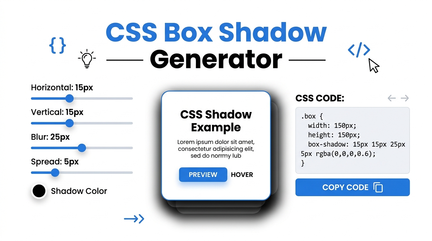
Free CSS Box Shadow & Background Gradient Generator
Visually design beautiful CSS box shadows, inset shadows, and background gradients. Generate cross-browser CSS code instantly and 100% offline.
Table of Contents
Want a soft, natural-looking shadow but tired of guessing at the offset and blur values? Drag the sliders, watch the shadow update live on a preview box, and copy the finished CSS. It saves the trial-and-error of tweaking numbers and refreshing to see the result.
⚡ CSS Visual Studio Pro
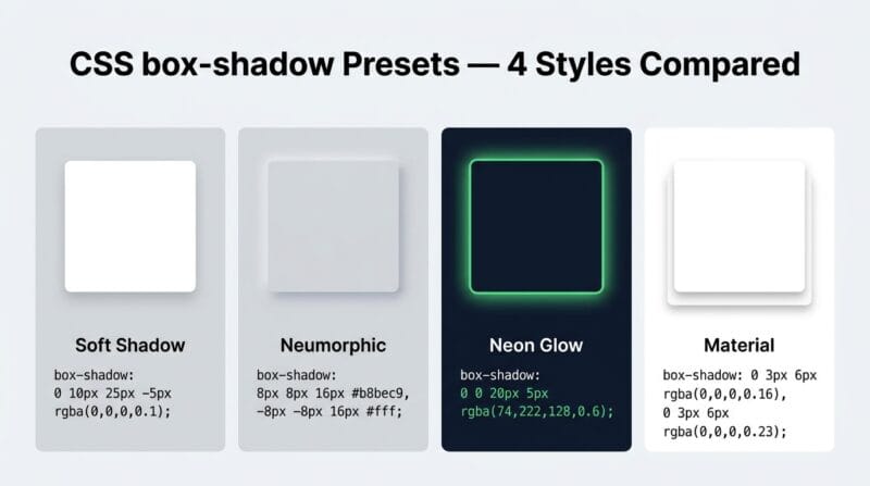
The 🌑 Shadow tab stacks up to four independent shadow layers — each with its own X offset, Y offset, blur radius, spread, colour, opacity, and inset toggle. Click any of the 12 preset cards (Soft, Hard, Neumorphic, Glow Blue, Glow Purple, Floating, Material, Neon, Long, Crisp, Inner, Double) to instantly apply it to the preview. Change the preview element shape between Square, Circle, Pill, and Card. Set independent background and box colours. The generated CSS output includes both standard and -webkit-/-moz- prefixed declarations.
The 🌈 Gradient tab supports Linear, Radial, and Conic gradients with three independently positioned colour stops and a gradient text mode (background-clip: text). Eight gradient presets cover Ocean, Sunset, Aurora, Candy, Dark, Fire, Radial, and Mint. The ✍️ Typography tab generates font size, weight, style, line height, letter spacing, text transform, text shadow, and optional Google Fonts @import in one CSS block. The 📦 Border tab controls all four corners independently plus border style, outline/offset, and eight CSS clip-path shapes (Circle, Triangle, Hexagon, Star, Rhombus, Parallelogram, Arrow).
The ⚡ Transform tab controls all six CSS transform functions (rotate, scale, translateX/Y, skewX/Y) plus eight CSS filters (blur, brightness, contrast, saturate, hue-rotate, grayscale, sepia, invert) with a full transition generator — property, duration, timing function, and delay. The 🎯 Snippets tab generates production-ready Flexbox layouts, CSS Grid templates, full @keyframes animations (12 types with Play Preview), and Glassmorphism cards with backdrop-filter, background opacity, and border colour controls.
Click 🌑 Shadow for box shadows, 🌈 Gradient for backgrounds, ✍️ Typography for text CSS, 📦 Border for shapes, ⚡ Transform for transforms and filters, or 🎯 Snippets for Flexbox, Grid, Animation, and Glassmorphism. The live preview box updates for every tab instantly. Use 💡 Load Sample to see a working example.
All sliders, colour pickers, and selects update the preview in real time. In the Shadow tab, click ➕ Add Shadow Layer to stack multiple shadows. Click any preset card to apply it instantly. In the Border tab, drag each corner radius slider independently. In the Transform tab, every filter slider updates the preview element live — drag the Hue Rotate slider to see colour shifting in action.
Use the sidebar Preview Controls to switch the stage background between Light, Dark, Gradient, and Checkered modes. Upload any image as the preview background to test shadows and glass effects against real content. Change the preview shape in the Shadow tab (Square, Circle, Pill, Card). Switch between desktop and mobile views by resizing your browser.
The CSS Output panel at the bottom always shows ready-to-use CSS for the active tab. Click 📋 Copy CSS and paste directly into your stylesheet, WordPress Custom CSS, or code editor. Recent outputs appear in the sidebar for quick reference. The Animation tab also includes a ▶ Play Preview button to preview the animation on the element before copying.
Last updated: June 2026
🔴 Multi-Layer Box Shadows — Why One Layer Is Never Enough
A single box-shadow produces one dimensional result — one offset direction, one blur radius, one colour. Professional UI design uses multiple shadow layers to simulate realistic depth. The CSS box-shadow property accepts comma-separated shadow definitions, each rendered independently. A Material Design elevation uses two layers: a short, dark, sharp shadow for the contact shadow and a taller, lighter, diffused shadow for the elevation shadow. Neumorphic design uses two shadows in opposite directions — one lighter (highlight) and one darker (shadow) — with the element colour between them to create the illusion of extrusion from the background surface.
The Shadow tab lets you build up to four independent layers. Each layer has its own X offset (−50px to 50px), Y offset, blur radius (0 to 100px), spread radius (−30px to 50px), colour, and opacity. Negative spread shrinks the shadow — combined with a large Y offset and blur, this creates the “floating card” effect where the shadow disappears at the top and concentrates at the bottom. The inset toggle converts any layer to an inner shadow, drawing depth into the element rather than projecting it outward. Stacking an inset layer with an outward layer produces complex light-and-shadow combinations that would take hours to hand-code through trial and error.
🟡 Three-Stop Gradients and Conic Gradients — Beyond Basic Two-Color Fades
Two-colour gradients are the minimum viable gradient — they work, but rarely produce memorable results. Three-colour gradients with independently positioned stops enable gradients that shift through multiple hues across the element: from deep blue at 0% through purple at 50% to pink at 100%. The stop position sliders in the Gradient tab let you compress or expand each colour zone — push Stop 2 to 20% and you get a dominant blue field that transitions quickly to purple then slowly to pink. Push Stop 2 to 80% and you get the inverse: a quick blue-to-purple transition at the start and a dominant pink field.
Conic gradients rotate colour stops around a centre point rather than transitioning along a linear or radial axis. They are the basis for pie charts, colour wheels, and angular progress indicators — all in pure CSS without SVG or JavaScript. The gradient text mode uses background: linear-gradient(...) combined with -webkit-background-clip: text and -webkit-text-fill-color: transparent to apply the gradient as the text fill colour. Browser support for this effect is broad (Chrome, Firefox, Safari, Edge) but the -webkit- prefix remains necessary for some WebKit implementations. The generated CSS includes both prefixed and unprefixed versions.
🟢 Typography CSS — From Font Size to Text Shadow in One Output Block
The Typography tab generates a complete .element CSS block from a single set of controls. Font size (8px–96px), line height (1.0–3.0), letter spacing (−5px to 20px), font weight (300–900), font style, and text transform combine in one output. Negative letter spacing (−1px to −3px) is increasingly used in large display headings — tight tracking on 64px–96px headings creates a sophisticated editorial look that widely-spaced text at the same size doesn’t achieve. Letter spacing on small body text at negative values causes legibility problems and should be avoided below 16px.
The text shadow controls generate the text-shadow property, which accepts X offset, Y offset, blur radius, and colour. Unlike box-shadow, text-shadow has no spread radius and no inset option, and has no browser-prefixed versions — it’s been fully supported without prefixes since CSS3. Setting X, Y, and blur all to 0 with a contrasting colour creates a solid outline effect. Setting blur to 8–20px with the same hue as the text creates a glow. If you enter a Google Font name, the tool generates both the @import URL for the stylesheet and the font-family declaration — paste both into your CSS and the font loads from Google’s CDN.
🟢 CSS clip-path Shapes — What They Are and When to Use Them
clip-path masks the visible area of an element to a defined shape, hiding everything outside the path. Unlike border-radius which rounds corners, clip-path can produce arbitrary polygon shapes. clip-path: circle(50%) creates a perfect circle from any element. clip-path: polygon(50% 0%, 0% 100%, 100% 100%) produces a triangle by defining three vertex coordinates as percentage values. The eight preset shapes in the Border tab — Circle, Triangle, Hexagon, Star, Rhombus, Parallelogram, Arrow — each use a different polygon() or circle() function. One important constraint: clip-path clips the element’s box-shadow too, since the shadow is drawn outside the element boundary that clip-path masks. If you need both a shape and a visible shadow, apply the shadow to a parent wrapper element and clip-path to the child.
- 🔵 Border radius and clip-path can be combined — a hexagonal clip-path with rounded corners requires a
path()function rather thanpolygon(), supported in Chrome 88+ and Firefox 97+. - 🟠 Outline vs border: outlines don’t affect layout (they don’t push other elements), are drawn outside the element, and don’t respect border-radius in all browsers. Borders affect layout box dimensions; outlines do not. Use outline for focus rings; use border for decorative borders.
- 🟣 outline-offset creates a gap between the element and its outline — particularly useful for focus rings where a 2px offset makes the ring clearly visible against both light and dark backgrounds simultaneously.
🟡 CSS @keyframes Animations — Generated Ready to Use
The Animation generator in the Snippets tab produces full @keyframes blocks for 12 animation types. Each generates the complete @keyframes definition and the corresponding animation shorthand property — both are required for the animation to work. The duration slider (0.1s–3.0s), iteration selector (1, 2, 3, or infinite), and animation type drive the output. Click ▶ Play Preview to run the animation on the preview element before copying — this lets you verify timing and appearance without pasting into a live page first.
The Glassmorphism generator creates the CSS for frosted glass cards — a design trend built on backdrop-filter: blur() combined with a semi-transparent background colour and a subtle border. The backdrop blur filter blurs whatever is behind the element, not the element itself — requiring a visible background content layer (gradient, image, or other content) behind the glass card for the effect to be visible. The three scene backgrounds in the tool (Purple, Pink, Ocean) demonstrate this: the glass card only looks like glass when the blurred background is sufficiently complex. On a solid background, backdrop blur has no visible effect. Use our CSS Visual Studio Pro to generate glassmorphism CSS and test it against multiple background scenes in seconds. For more CSS concepts see our complete CSS generator guide.
Why does the glassmorphism effect not show on a solid background?
backdrop-filter: blur() blurs whatever is rendered behind the element in the stacking context. On a solid single-colour background, there is nothing complex to blur — the frosted glass effect becomes invisible. Use a gradient, photograph, or layered content behind your glass card. The preview stage’s Gradient and Checkered modes in the sidebar demonstrate this correctly. In production, the page content appearing behind the fixed glass card is what gets blurred.
What’s the spread radius in box-shadow and when should it be negative?
Spread radius expands or contracts the shadow before blur is applied. Positive spread makes the shadow larger than the element on all sides. Negative spread shrinks it smaller than the element. The “floating card” effect uses a large positive Y offset combined with a negative spread: the shadow appears as a concentrated pool beneath the element rather than surrounding it. Negative spread on a tightly blurred shadow creates subtle depth cues without the shadow being obviously visible at the edges.
Can I combine transform properties from different tabs?
Each tab generates CSS for its own property set independently. To combine multiple properties — for example, a box-shadow from the Shadow tab, a border-radius from the Border tab, and a transform from the Transform tab — copy each CSS block separately and manually merge them into one .element rule in your stylesheet. The tool generates per-property blocks rather than combined rules to keep the output clean and applicable to any selector.
Why does clip-path cut off my box-shadow?
clip-path clips the element’s painted area including its box-shadow, because the shadow is part of the element’s rendering. The workaround: apply clip-path to a child element and box-shadow to its parent wrapper. The parent is not clipped so its shadow remains visible; the child renders in the desired shape. Alternatively, use filter: drop-shadow() instead of box-shadow — drop-shadow follows the visual shape of the clipped element rather than the box boundary.
Do CSS animations require JavaScript?
No. CSS @keyframes animations run entirely in the browser’s rendering engine with no JavaScript. The generated CSS output from the Animation tab is pure CSS — paste the @keyframes block and the animation property into your stylesheet and the animation runs. JavaScript is only needed if you want to trigger animations dynamically, pause/resume them programmatically, or respond to animation events like animationend. For entrance animations triggered by scrolling, you need either JavaScript or the CSS animation-play-state property toggled via an IntersectionObserver.
What is the difference between filter and backdrop-filter?
filter applies visual effects to the element itself — its background, content, borders, and shadows. backdrop-filter applies effects to the area behind the element. A filter: blur(10px) on a card blurs the card’s own content. A backdrop-filter: blur(10px) on the same card blurs whatever is behind it, while the card’s own content remains sharp. Glassmorphism uses backdrop-filter specifically because the frosted effect is on the background, not the card content.
Can I apply Google Fonts without a plugin in WordPress?
Yes. The Typography tab generates a complete @import URL for any font name you enter. In WordPress, add the @import line at the very top of your Additional CSS (Appearance → Customize → Additional CSS). The browser fetches the font from Google’s CDN on page load. Note that Google Fonts requests create an external network dependency and have minor GDPR implications in some regions — self-hosted alternatives using @font-face with downloaded font files avoid these issues.
What does outline-offset do that margin doesn’t?
outline-offset sets the gap between the element’s border edge and the start of its outline, without affecting layout. The outline appears outside the element and is ignored by the box model — it does not push adjacent elements or expand the containing block. margin affects layout and moves the element relative to its siblings. For focus indicators, outline-offset: 2px creates a clearly visible ring separated from the element without disrupting the page layout at all.
Is the generated CSS browser-compatible without extra steps?
The tool generates standard CSS3 with -webkit- prefixes where still needed (gradient text background-clip, backdrop-filter in some browsers). For box-shadow, transform, filter, border-radius, and @keyframes, no prefixes are required for Chrome 90+, Firefox 90+, Safari 15+, or Edge 90+. For broader compatibility including IE11, use a PostCSS autoprefixer in your build pipeline — but IE11’s market share is negligible for most projects and the generated CSS works correctly in all modern browsers without modification.