All-in-One Color Studio & Color Format Converter (HEX, RGB, HSL, CMYK)
Convert HEX, RGB, HSL, and CMYK color codes instantly with this free, 100% offline color format converter. Features live visual preview and one-click CSS copy.
Table of Contents
Have a hex code from a design file but need the RGB or HSL to drop into your CSS? Enter a color in any format and read it back in hex, rgb, hsl, hsv, and cmyk together, next to a live swatch. It removes the tedious back-and-forth of converting color codes by hand.
🎨 Color Studio Pro
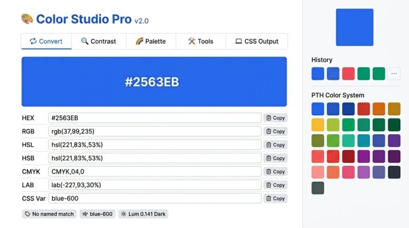
The 🔄 Convert tab handles seven color formats simultaneously — HEX, RGB, HSL, HSB, CMYK, LAB, and CSS Custom Properties. Type any format in any field and every other format updates instantly. The tool automatically detects whether your color matches a CSS named color (cornflowerblue, coral, steelblue — 140+ names checked) and finds the nearest Tailwind CSS color class within a perceptual distance threshold. Copy individual formats with single-click copy buttons, or click Copy All Formats to grab every format at once in a single clipboard operation.
The 🔍 Contrast tab calculates WCAG 2.1 contrast ratios against white text, black text, and any custom color you pick. Each combination shows three badge levels — AA (4.5:1 normal text), AA Large (3:1 for 18pt+ text), and AAA (7:1 strict). Exact contrast ratios display numerically — 4.7:1, 12.3:1 — not just pass/fail. When both white and black text fail the AA threshold, a gold suggestion box appears recommending which achieves the better ratio. The custom text color picker lets you check any hex color combination for your specific design context.
The 🌈 Palette tab generates five harmony types from any active color — Complementary (180°), Triadic (120° apart), Analogous (±30°), Split-Complementary, and Monochromatic — plus a 10-step tint and shade scale with one-click CSS variable export. The 🛠️ Tools tab adds an Image Color Picker (upload any image, click any pixel to extract its exact HEX and RGB values), a Gradient Generator with CSS output, and a 6-type Color Blindness Simulator showing Deuteranopia, Protanopia, Tritanopia, Achromatopsia, Deuteranomaly, and normal vision side by side.
Click the color picker square to open the native browser color wheel, or type directly into any format field — HEX (#2563EB), RGB (37, 99, 235), HSL (221, 83%, 53%), or CMYK. The large color preview hero updates instantly. Click 🎲 Random to generate a random color, or 💡 Load Sample to load PTH Blue for reference.
Switch to the 🔍 Contrast tab. The two main boxes show your color as the background with white text and black text — WCAG AA, AA Large, and AAA badges update live. Pick a custom text color using the color picker to check any specific combination. If neither white nor black passes AA, a gold suggestion box recommends the better option automatically.
Switch to 🌈 Palette. A 10-step shade scale appears instantly — click any shade to load it as your active color. Complementary, triadic, analogous, split-complementary, and monochromatic harmony palettes generate below. Click 📋 Copy CSS Vars on the shade scale to copy all 10 shades as --shade-50 through --shade-900 CSS variables ready to paste into your stylesheet.
Switch to 💻 CSS Output. Choose from four formats: CSS Properties (background, color, border, box-shadow), CSS Variables (with dark/light variants and alpha channels), Design Tokens JSON (compatible with Figma and Style Dictionary), or Tailwind Config with 50/500/900 scale entries. Enter your token name in the input field, then click 📋 Copy Code to paste directly into your project.
🔴 Why Color Format Conversion Matters Across Design and Development Workflows
A single color exists simultaneously in multiple formats — and different tools, contexts, and outputs expect different ones. Figma exports hex values. CSS stylesheets use hex, RGB, or HSL. Print workflows require CMYK. Machine learning pipelines and color science calculations work in LAB color space. Tailwind CSS uses named utility classes. Design tokens use JSON. When a brand color changes from one format to another as it moves through a workflow — from the designer’s hex code to the developer’s RGB variable to the printer’s CMYK specification — conversion errors introduce subtle but real color shifts if the wrong formula is used.
The Convert tab in this tool handles all seven formats in a single view with live bidirectional updates. Every field accepts input — type an HSL value, and HEX, RGB, CMYK, and LAB update automatically. The conversion chain uses accurate mathematical formulas: RGB→HSL through the standard min/max algorithm, RGB→CMYK through the ink coverage formula, and RGB→LAB through the full sRGB→XYZ→CIE L*a*b* pipeline including the D65 illuminant white point and gamma correction. LAB is perceptually uniform — equal numerical distances correspond to equal perceived color differences — which makes it valuable for color difference calculations, gradient interpolation, and accessibility analysis beyond what RGB or HSL can express.
🟡 WCAG 2.1 Contrast Ratios — The Mathematics Behind Pass and Fail
The WCAG 2.1 contrast ratio formula is: (L1 + 0.05) / (L2 + 0.05) where L1 is the relative luminance of the lighter color and L2 is the relative luminance of the darker color. Relative luminance is calculated from linearised sRGB values using the formula: L = 0.2126R + 0.7152G + 0.0722B where each channel is first gamma-corrected: values ≤ 0.03928 divide by 12.92, and values above use the power function (v + 0.055) / 1.055 ^ 2.4. The 0.05 offset in the contrast formula prevents division by zero when comparing against pure black (luminance 0).
The WCAG 2.1 thresholds are: 4.5:1 for AA conformance on normal text (under 18pt regular or 14pt bold), 3:1 for AA conformance on large text (18pt+ regular or 14pt+ bold) and for UI component boundaries, and 7:1 for AAA conformance on normal text. A ratio of 1:1 means identical colors — zero contrast. Pure black on pure white achieves 21:1, the maximum possible ratio. The Contrast tab displays all three thresholds simultaneously so you can determine at a glance which level your color combination achieves and for what text sizes.
🟢 How the Auto-Fix Suggestion Works
When a color’s contrast against both white and black falls below the 4.5:1 AA threshold — which happens in the mid-luminance range around lightness values 35–65% — the tool compares the two ratios and suggests the higher one. This is rarely needed for highly saturated colors since deep blues, greens, and reds almost always pass with white text while pale yellows and light grays pass with black text. The problematic zone is medium saturation colors — muted greens, dusty oranges, medium grays — where neither extreme provides sufficient contrast. The fix suggestion shows the exact ratio achieved with the recommended pairing, letting you decide whether to switch text color or adjust the background color’s lightness in the HSL tab.
🟡 Color Harmony Systems — What Each Palette Type Means for Design
Color harmony theory describes relationships between colors on the hue wheel (0–360°). Each harmony type produces a different visual dynamic. Complementary (180° opposite) creates maximum contrast — blue and orange, red and green, purple and yellow. High visual tension, effective for call-to-action buttons against content backgrounds. Triadic (120° apart) gives three evenly spaced colors with balanced contrast — primary, secondary, tertiary in equal visual weight. Common in sports team branding and children’s design. Analogous (adjacent ±30°) creates calm, cohesive palettes with low contrast between elements — used in nature-inspired design, gradients, and backgrounds where visual harmony matters more than contrast.
Split-Complementary is a safer version of complementary: instead of the exact opposite hue, it uses the two hues adjacent to the complement (±30° from the complement). It retains visual tension while being less jarring. Monochromatic uses the same hue at different lightness values — five variations at 20%, 35%, 50%, 65%, and 80% lightness. This produces the most cohesive possible palette and is the foundation of design systems like Tailwind CSS (which uses 50-900 numeric scales for each hue). The 10-step shade scale in the Palette tab maps directly to Tailwind’s scale structure — click Copy CSS Vars to get --shade-50 through --shade-900 as CSS custom properties.
- 🔵 Click any palette swatch to load it as the active color — the entire tool (contrast, palette, CSS output) updates for that new color instantly.
- 🟠 Color History sidebar automatically saves your last 12 colors — click any history swatch to restore a previous color without retyping.
- 🟣 PTH Color System presets — the sidebar shows all 12 WCAG AA approved colors from the PTH v3.1 instruction set, each verified to pass 4.5:1 contrast on light backgrounds.
🟡 Image Color Picker, Gradient Generator, and CSS Output Formats
The Image Color Picker in the 🛠️ Tools tab uses an HTML5 canvas element and the getImageData() API to read pixel values directly in the browser. Upload any JPEG, PNG, WebP, or GIF image — the image renders on a canvas with a crosshair cursor. Click any pixel to extract its exact RGB values, which convert to HEX automatically. The tool displays both the HEX code and RGB values with a live swatch. Use Color gives you the extracted color as the active color throughout the entire studio — contrast ratios, palette, and CSS output all update for the picked color. This is useful for brand color extraction, matching colors from screenshots, and identifying exact values from reference images without external tools.
The Gradient Generator produces a linear-gradient() CSS rule with the angle, two color stops, and a -webkit- prefixed fallback for older Safari versions. The CSS Output tab generates four distinct output formats. CSS Properties gives a ready-to-paste .element block with background, text, border, outline, and box-shadow set to your color. CSS Variables generates a :root block with the base color, a 15%-darker variant, a 15%-lighter variant, the raw RGB channel values for use in rgba() expressions, HSL format, and two pre-built alpha variants at 30% and 10% opacity. The Design Tokens JSON follows the W3C Design Token Community Group format, compatible with Figma’s Token Studio plugin and Style Dictionary. Tailwind Config exports a module.exports object with 50, 500, and 900 scale entries for your custom color. Use our Color Studio Pro to generate all four formats from any color without switching between tools.
What is the difference between HSL and HSB color models?
Both use Hue (0–360°) and Saturation (0–100%), but differ in the third channel. HSL uses Lightness — at 0% lightness the color is black, at 100% it is white, and at 50% it is the purest hue. HSB (also called HSV) uses Brightness/Value — at 0% brightness the color is always black, and at 100% brightness with 100% saturation you get the pure hue. At 100% brightness with 0% saturation you get white. CSS supports HSL natively; HSB is used in Photoshop, Illustrator, and most design tools.
Why does the LAB value look different from what Photoshop shows?
LAB values depend on the reference white point used for the XYZ conversion. This tool uses the D65 illuminant (standard daylight, 6500K) which is the standard for web and digital color — the same reference point used by CSS Color Level 4 and browser implementations. Photoshop historically used D50 (5000K, print-optimised) for some profiles. Converted colors may differ slightly between D50 and D65 reference points. For web development work, D65 is the correct reference.
How does the Tailwind color match work?
The tool calculates the Euclidean distance between your color’s RGB values and every color in the Tailwind CSS v3 palette — from slate-50 to rose-900. The nearest match by perceptual RGB distance is returned. If the distance is under 30 RGB units, the exact class name is shown. If over 30, a tilde (~) indicates a close approximation. The match covers the primary color scale; exact matches exist for all Tailwind v3 colors since they’re hardcoded in the lookup table.
Can I use the image picker on photographs to extract brand colors?
Yes. Upload a brand asset, logo screenshot, or product photo and click the dominant color area. The crosshair cursor appears as you hover and the exact pixel RGB values are extracted on click. For JPEGs, note that compression artifacts can slightly shift pixel colors — for precise brand color extraction, use PNG or WebP source files. The Use Color button loads the picked color throughout the entire studio so you can immediately check its WCAG contrast ratios and generate CSS variables.
What is the Design Tokens JSON format compatible with?
The JSON output follows the W3C Design Token Community Group specification — the emerging standard for design token exchange between tools. It is compatible with Figma’s Token Studio plugin (import directly into your Figma file), Style Dictionary (Amazon’s design token compiler that outputs to CSS, SCSS, iOS, Android), and Theo (Salesforce’s token system). The token includes the hex value, type annotation, descriptive text, and structured RGB, HSL, and CMYK data for each channel.
How accurate is the Color Blindness Simulator?
The simulation uses established RGB transformation matrices published in color science research for Deuteranopia, Protanopia, Tritanopia, and Deuteranomaly. These matrices are approximations — real color vision deficiency varies between individuals and is more complex than a linear transform captures. The simulator gives a reliable general indication of how your color appears to users with different types of color vision deficiency, but should not be treated as medically precise. Test critical UI decisions with real users whenever possible.
What does the PTH Color Validator in the CSS Output tab check?
The PTH Color Validator checks your color against two standards: WCAG 2.1 AA conformance as text on white and black backgrounds, and membership in the PTH Instruction v3.1 approved color list. The approved list contains 12 specific hex values verified to pass 4.5:1 contrast on light backgrounds — colors like #1d4ed8, #5b21b6, #047857, and #991b1b. Colors outside this list can still be used as backgrounds or decorative elements — the validator specifically flags their suitability as text colors on light backgrounds.
Can I save my color palettes for later?
The Color History sidebar stores your last 12 colors in browser session memory — they persist while the page is open but clear on refresh. For permanent storage, use the CSS Variables or Design Tokens JSON export to save your palette to a file. Copy the CSS Variables output and paste it into your project’s global stylesheet. The Design Tokens JSON can be committed to your repository and imported into Figma or your build pipeline for persistent team access.
Why does my CSS Custom Property show double the color in the Convert tab?
The CSS Variable field in the Convert tab outputs the full custom property declaration — --color-primary: #2563EB; — formatted for direct paste into a :root block. If you need just the hex value for use inside a var() call, copy from the HEX field instead. The full declaration format is intentional — it gives you a paste-ready line for your stylesheet without needing to add the property name and colon manually.