Image Layout HTML Generator Guide
Generate highly optimized, privacy-first Image Layout HTML snippets instantly. Zero server processing. Client-side execution for flawless DOM rendering.
Table of Contents
Last updated: June 2026
🔴 The Problem with WordPress Default Image Placement
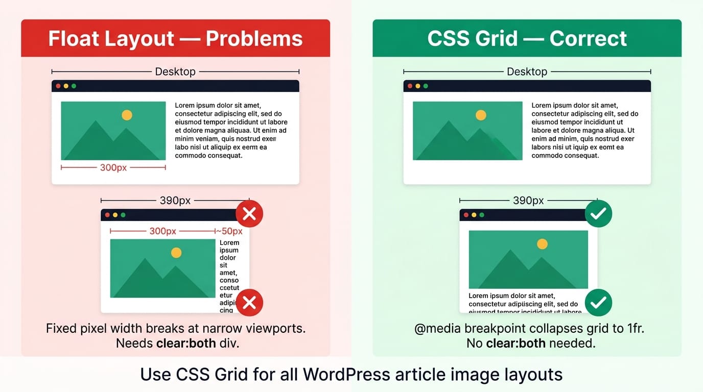
WordPress gives you three native image placement options: full width, aligned left with text wrap, and aligned right with text wrap. The alignment options use the old CSS float model — float:left with a fixed pixel width. On desktop at 1200px, a floated image at 300px looks fine. On a tablet at 768px, the same 300px image leaves only 420px for text. On a 390px phone, 300px of image beside 50px of text is unreadable. The browser doesn’t collapse the float at small viewport widths unless you explicitly write a media query to clear it — and WP’s native float implementation doesn’t include one.
CSS Grid solves this correctly. display:grid;grid-template-columns:1fr 1fr with a @media(max-width:680px) override that switches to grid-template-columns:1fr gives you a two-column desktop layout that stacks cleanly on mobile. The image goes full-width above the text — exactly the behaviour you want. The Article Image Placement Studio tool generates this grid HTML with your specific image URL, alt text, dimensions, and text content — no manual coding required.
🟡 CSS Grid vs Float — Why Grid Wins for Article Layouts
The CSS Grid Layout specification was designed exactly for two-dimensional content placement. A grid container with grid-template-columns: 48% 52% and gap: 28px creates two columns where each child element sits in its own grid cell — the image in one cell, the text in the other. Grid cells don’t overlap, don’t collapse unexpectedly, and don’t need clear:both divs to end the layout. Each child’s width is constrained to its cell with min-width:0 on the grid items, preventing the classic CSS Grid overflow bug where content wider than its container breaks out of the column.
Float layouts require three elements to work correctly: a float property on the image container, a minimum width constraint (otherwise at narrow viewports the float column collapses to nothing while the text column tries to fill the gap), and a clear:both div after the last paragraph to end the float context. Miss any one of these and you get layout breakage that’s invisible in the WP block editor preview but visible in the actual published article. Grid layouts need only one CSS property change at the breakpoint — grid-template-columns:1fr — and both columns collapse cleanly to full width with the image stacking above the text.
🟢 CLS, LCP, and Core Web Vitals — Why Image Attributes Matter
Cumulative Layout Shift (CLS) measures how much visible content jumps during page load. An <img> tag without explicit width and height attributes causes the browser to allocate zero vertical space for the image until the download completes — then the image expands and pushes everything below it down. On a 5 Mbps mobile connection loading a 200KB image, this produces a visible jump that Google counts against your CLS score. The fix is two HTML attributes: width="800" height="450". Combined with style="width:100%;height:auto;", the browser calculates the aspect ratio at parse time — 450/800 = 0.5625 — and reserves exactly the right vertical space before the image loads.
Largest Contentful Paint (LCP) measures when the largest visible element — usually the hero image — finishes loading. Adding loading="lazy" to a hero image defers its download until it enters the viewport, which actively harms LCP. Use loading="eager" (the browser default) for the first image above the fold, and add fetchpriority="high" to tell the browser to prioritise this resource over other early-page downloads. Use loading="lazy" on all images below the fold — this defers their download until they approach the viewport, reducing initial page weight and improving overall load speed.
🟡 8 Layout Patterns — Choosing the Right One for Each Section
Not every image needs the same treatment. Layout choice should be driven by the relationship between the image and the surrounding text.
🟢 Editorial Split Layouts
Image Left works when the image is the primary information and the text explains it — a diagram, architecture chart, or screenshot where the reader looks at the image first then reads the label. Image Right creates visual rhythm in long articles — alternate left and right every two or three sections. The alternating pattern signals topic transitions to readers scanning the page, keeping them reading rather than skipping. Wide 70/30 is for large technical diagrams that need to be big enough to read their internal labels — the 70% column gives the image room while keeping a short key-points list immediately beside it rather than orphaned below. Use the Column Width slider (30–70%) to find the right proportion for each specific image.
🟢 Multi-Image Layouts and Callout Box
Two Images side by side works for before/after (same subject, two states), comparison (option A vs option B), or consecutive steps where the sequence matters visually. Keep captions short — each column is 50% wide and caption text at 12px needs to fit without wrapping excessively. Three Images at repeat(3,1fr) works for three-step tutorials, three-feature showcases, or a grid of tool screenshots. At tablet width (680px), the three-column grid automatically drops to two columns; at phone width (420px), it goes single column. The Callout Box layout replaces the text column with a highlighted box — purple for notes, blue for info, green for tips, amber for warnings, red for important cautions. The icon, title, and text are all customizable in the tool. Use this when the content beside the image is a discrete call-to-action or warning rather than a continuation of the article narrative. You can also combine these layouts by placing an Image Left block, then a Three Images block for step screenshots — the Article Image Placement Studio generates each block separately for you to paste in sequence in WP.
- 🔵 Full Width — use for infographics, wide data tables as images, or any image that loses detail at 50% column width. Always include explicit width and height and a descriptive caption.
- 🟠 Centered (max-width) — use for square diagrams, icons, or UI screenshots that look awkward stretched to full column width. The max-width field (default 600px) limits the image to a natural size centered in the article column.
- 🟣 Gap selector — 16px for dense technical reference content where space is at a premium; 28px for standard editorial; 36px when the image and text are visually distinct and benefit from breathing room between them.
Why does WP’s built-in image alignment break on mobile?
WordPress native float alignment uses a fixed pixel width (e.g. width:300px;float:left) with no media query to clear it on small screens. On a 390px phone, a 300px floated image leaves only 90px for text — too narrow to read. CSS Grid with a breakpoint override (@media(max-width:680px){grid-template-columns:1fr}) collapses to single column automatically, stacking image above text cleanly.
Can I use these layouts without the tool by writing HTML manually?
Yes. The core pattern for a left-image layout is: <div style="display:grid;grid-template-columns:48% 52%;gap:28px;"> with two child divs — one containing your <img> tag and one containing your heading and paragraphs. Add a <style> tag with @media(max-width:680px){...} for mobile stacking. The tool generates this structure with your actual values and removes the need to remember the exact CSS each time.
What’s the difference between loading=”lazy” and loading=”eager”?
loading="lazy" defers image download until the image approaches the visible viewport — reducing initial page load weight. loading="eager" (the HTML default) fetches the image immediately regardless of viewport position. Use eager for your first above-the-fold image (hero/header) to avoid LCP penalty; use lazy for all images below the fold. Never set hero images to lazy — it actively harms your Core Web Vitals score.
Does the image need to be hosted on my WordPress site?
No — any publicly accessible image URL works. However, using WP Media Library URLs is strongly recommended for three reasons: LiteSpeed caching applies to local images, the WP image block handles srcset and responsive sizes automatically, and CDN configuration (if enabled) applies. External image URLs from other domains may trigger CORS warnings in some browser configurations.
What does min-width:0 on grid children do?
By default, grid children have min-width:auto, which means their minimum width is their content’s intrinsic width. For an image, that’s the image’s natural pixel width — which can be wider than the grid column, causing overflow. Setting min-width:0 overrides this, allowing the image to shrink below its natural width and respect the width:100% CSS rule. Without it, wide images break out of their grid columns at narrow viewport widths.
How do I alternate Image Left and Image Right in a long article?
Generate an Image Left block for your first image section, then generate a separate Image Right block for the next image section. Paste them in sequence in WP — each is a separate HTML block. The grid order property in the Image Right layout swaps the columns visually without changing the DOM source order, keeping the correct reading order for screen readers.
Do I need to add the responsive CSS for every layout block?
The generated code includes an inline <style> block with the responsive rule for each layout. If you paste multiple layout blocks in one article, the repeated style tags are harmless — browsers handle duplicate media query rules without error. Alternatively, add the one-line media query once in WP Customizer → Additional CSS to cover all articles site-wide.
Can I use the Callout Box beside a YouTube video embed?
Yes. Instead of an image URL, paste your YouTube iframe embed code as a WP HTML block above a Callout Box generated separately. For true side-by-side, wrap both in a single grid div manually. Use grid-template-columns:1fr 1fr — first child is an iframe with width="100%" and fixed height, second child is the callout div. The tool handles image + callout; for video + callout, combine the generated callout HTML with a manual iframe wrapper.
Why is 680px the mobile breakpoint instead of 768px?
768px is the conventional tablet breakpoint, but most tablets at 768px can comfortably display a two-column layout. 680px targets the range where a 48/52% split genuinely becomes too narrow to read — approximately 340px per column on a device just above tablet size. At 680px the grid collapses to single column, giving each element the full viewport width. This avoids collapsing the layout on large tablets where two columns still work well.