SEO & WCAG Friendly HTML Image Layout Generator
Create perfectly aligned, SEO-friendly, and responsive image layouts for your blog with our Article Image Placement Studio. Generate 100% offline, zero CLS HTML code.

Table of Contents
Writing a long post and unsure where the images should go? Plan your image placements against the article structure, so each visual lands next to the point it illustrates. It helps you space visuals evenly instead of clustering them or leaving walls of text.
🖼️ Article Image Placement Studio
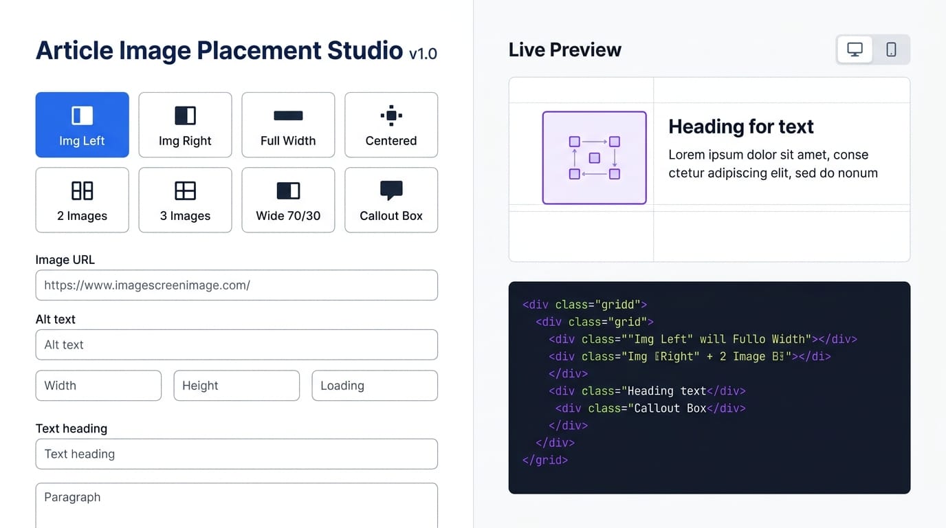
Choose from Image Left, Image Right, Full Width, Centered, Two Images, Three Images, Wide 70/30, or Callout Box layouts. Click any layout button and the sidebar Live Preview updates instantly — switch between Desktop (full width) and Mobile (390px) preview modes to verify how your layout stacks on small screens before copying the code.
Enter your WP Media Library image URL, alt text, exact width and height (for CLS prevention), loading strategy (lazy or eager), and optional caption. For split layouts, type your H3 heading and up to two paragraphs directly into the text fields — the preview shows your real content beside the image, not placeholder text. Two-image and three-image layouts include separate URL, alt, and caption fields for each image.
Click 🚀 Generate HTML Code and the tool outputs clean, production-ready HTML with inline styles — no external CSS classes required. Column width slider (30–70%) and gap selector (16–36px) fine-tune the layout proportions. The callout box builder lets you pick icon, title, text, and color theme (purple, blue, green, amber, red). Click 📋 Copy Code and paste directly into a WP HTML block.
Click any of the 8 layout buttons — Image Left, Image Right, Full Width, Centered, 2 Images, 3 Images, Wide 70/30, or Callout Box. The Live Preview sidebar updates instantly. Use 💡 Load Sample to see a complete working example.
Paste your WP Media Library image URL into the Image URL field. Add descriptive alt text, set the exact pixel width and height (copy from WP Media Library), choose lazy or eager loading. Add an optional caption — leave blank to hide it.
For split layouts, type your H3 heading and paragraphs in Step 3. Adjust the Image Column Width slider and Gap selector in Step 4. Toggle rounded corners, border, and margin on/off. For Callout Box, set icon emoji, title, body text, and color theme.
Click 🚀 Generate HTML Code. Preview mobile layout by clicking 📱 Mobile in the sidebar. Click 📋 Copy Code, then paste into a WP HTML block in Visual Editor. The code includes inline responsive CSS — no separate stylesheet needed.
Last updated: June 2026
🔴 Why HTML Image Layouts Matter for Article SEO and Reader Engagement
Image placement isn’t decoration. It’s a functional decision that affects time-on-page, Core Web Vitals, and how readers scan your content. A diagram pasted as a full-width image after a paragraph forces the reader to stop reading, look at the image, then find their place in the text again. The same diagram placed beside the relevant paragraph creates a single visual unit — the eye reads text and processes the image simultaneously. That’s the layout pattern professional editorial teams use: image beside the explanation it supports, not after it.
WordPress doesn’t make this easy. The block editor’s default image block is full-width or fixed-percentage, with no built-in text-wrap. The classic float approach — float:left with a manual clear:both — works but produces inconsistent mobile behaviour when column widths aren’t carefully set with min-width constraints. CSS Grid layouts solve the stacking problem correctly: grid-template-columns: 1fr 1fr with a @media(max-width:680px) override switches to 1fr on mobile, ensuring the image sits above the text rather than squeezing beside it at 50% of a 390px screen.
🟡 8 Layout Templates — When to Use Each One
Each layout pattern serves a different content type. Choosing the right one improves readability without requiring design experience.
🟢 Split Layouts — Image Left, Right, and Wide 70/30
Image Left is the default editorial pattern — diagram on the left, explanation on the right. Works because Western reading direction (left to right) means eyes land on the image first, building context before the text. Use this for technical diagrams, flowcharts, and tool screenshots where the image is the subject and the text explains it. Image Right creates visual rhythm in long articles when alternated with Image Left sections — the change in image position signals a new topic to readers scanning the page. Alternate these two layouts every two to three H2 sections.
Wide 70/30 is the power layout for large diagrams. The image takes 70% of the column (adjustable via the slider) and the text column is narrow — 30% or less. Use this for complex infographics, architecture diagrams, or multi-stage flow diagrams where you need the image to be large enough to read the labels, but still want to keep a short list of key points beside it rather than below it. The Column Width slider in the tool lets you set any proportion from 30/70 to 70/30 in 2% increments.
🟢 Multi-Image Layouts — Two Images and Three Images
Two Images suits before/after comparisons, option A vs option B, or two sequential screenshots. Each image column is 50% on desktop, stacking to 100% on mobile. Add individual alt text and captions for each image — the tool generates separate fields for each. Three Images uses a repeat(3,1fr) grid — three equal columns on desktop, two columns on tablet (max-width:680px), and one column on small mobile (max-width:420px). Best for step-by-step tutorial screenshots showing Step 1, Step 2, Step 3 — or a three-feature showcase with one screenshot per feature. Keep caption text short — three columns leave limited horizontal space.
🟢 Callout Box Layout — Image + Highlighted Note
The Callout Box layout places your diagram on the left and a highlighted information box on the right. Use it when the diagram needs a key takeaway, warning, privacy note, or pro tip beside it rather than a full paragraph explanation. Five color themes are available: purple (default — general note), blue (informational), green (success/tip), amber (warning), red (danger/caution). The callout box builder in the tool generates the full inline-styled HTML with your chosen icon emoji, title, and body text. The resulting code doesn’t depend on any external CSS class — it’s fully self-contained using inline styles, so it works in any WP HTML block without a stylesheet.
- 🔵 Column Width slider — sets the image column from 30% to 70%, text column fills the remainder. Drag left for a narrow image beside long text; drag right for a wide diagram with a short note.
- 🟠 Gap selector — 16px (tight, dense technical content), 20px (compact), 28px (standard editorial), 36px (spacious, breathing room between diagram and explanation).
- 🟣 Responsive CSS — every generated layout includes a
@media(max-width:680px)rule that collapses the grid to a single column. On mobile the image always appears above the text — never beside it at unreadable sizes.
🟡 CLS Prevention — Why Width and Height Matter in Every Image Tag
Cumulative Layout Shift (CLS) is a Core Web Vitals metric that measures how much page content jumps during load. An image without explicit width and height attributes causes the browser to reserve zero vertical space until the image downloads — then the image expands and pushes all content below it down. On a slow mobile connection, this produces a visible jump that Google penalises in search rankings and that users find disorienting.
The tool requires explicit width and height for every image — these values appear directly in the generated img tag as width="800" height="450". Combined with style="width:100%;height:auto;", the browser calculates the correct aspect ratio at parse time and reserves the exact vertical space before the image loads. Zero layout shift. Find your image’s exact pixel dimensions in WP Media Library — click the image, then “Edit image” to see the full resolution. Enter those values in the tool’s Width and Height fields. The output handles CSS scaling automatically.
For hero images — the first image above the fold — change Loading from lazy to eager in the tool’s dropdown. This removes the lazy loading delay for the most important image on the page, which improves LCP (Largest Contentful Paint). Use Article Image Placement Studio for all image blocks across your articles to ensure every image tag follows the same CLS-safe, WCAG-compliant pattern consistently.
Does the generated code require any extra CSS or stylesheet?
No. Every layout uses inline styles only — no external classes, no separate stylesheet required. Paste the generated code directly into a WP HTML block and it works immediately. The responsive media query is injected as a small inline <style> block within the generated output.
Why does the tool ask for image width and height?
Explicit width and height attributes prevent Cumulative Layout Shift (CLS) — a Core Web Vitals metric that affects Google rankings. Without them, the browser reserves no vertical space for the image until it downloads, causing visible content jumps. Find your image dimensions in WP Media Library and enter them in the tool’s Width and Height fields.
How does the mobile preview work?
Click 📱 Mobile in the Live Preview sidebar to switch the preview panel to a 390px viewport simulation. Split layouts (Image Left, Right, Wide 70/30, Callout) collapse to a single column with the image above the text. Multi-image layouts (2 Images) go to full width; Three Images goes to a 2-column then 1-column grid at smaller breakpoints.
Can I use this for hero images that load above the fold?
Yes. Change the Loading dropdown from “lazy” to “eager” for any above-the-fold image. The generated img tag will include loading="eager", which tells the browser to fetch the image immediately rather than deferring it. This improves Largest Contentful Paint (LCP), a Core Web Vitals metric. Use lazy loading for all images below the fold.
What’s the Column Width slider for?
The slider controls the image column’s percentage of the total layout width for split layouts (Image Left, Right, Wide 70/30, Callout Box). The text column fills the remaining percentage automatically. Drag to 70% for wide diagrams with short notes; use 48% (default) for equal split; go to 35% for a small image beside a long explanation paragraph.
How do I add multiple images for a 2-column or 3-column layout?
Select “2 Images” or “3 Images” from the layout picker. The Image Settings section expands to show separate URL, alt text, and caption fields for each image (Image 2 for 2-col, Image 2 and Image 3 for 3-col). Fill each one with its respective WP Media Library URL and alt text, then click Generate.
Can I change the callout box color after generating code?
Yes — select a different color chip (purple, blue, green, amber, red) before clicking Generate, or change it after and regenerate. The colors are applied as inline background, border, and text colors in the generated HTML — you can also edit the hex values directly in the output code if you need a custom color not in the five presets.
Where do I paste the generated code in WordPress?
In the WP block editor, add a new HTML block (click +, search “HTML”, or use the Custom HTML block option). Paste the generated code directly into the HTML block. Switch to Preview to verify the layout. Do not paste into the Visual/Paragraph block — the inline styles and grid CSS require the raw HTML block to render correctly.
My image URL is from WP Media Library — how do I find the exact URL?
In WP Admin go to Media → Library, click your image, then click “Copy URL to clipboard” on the right panel. Use the full-size URL (not a thumbnail version) for best quality — the tool’s CSS scales it to fit the column using width:100%;height:auto. The width and height attributes should match the full-size image dimensions shown in that same panel.