Color Theory for Web Developers
Stream your frontend design workflow with a free offline color format converter. Discover the mathematical theory behind client-side color space translation.
Table of Contents
Last updated: June 2026
🔴 How Color Formats Work — and Why Each One Exists
Computers represent color as numbers. The question is which numbers, in which coordinate system, for which purpose. Every color format is a different mathematical coordinate system for describing the same perceptual experience. No format is universally “correct” — each is optimised for a specific use case, and converting between them is a matter of applying the right formula.
The format you choose affects what you can intuitively control. Changing the blue channel in RGB doesn’t tell you whether you’re making the color warmer or cooler, lighter or darker. Changing the lightness value in HSL does exactly one thing — it moves the color toward white or toward black along a perceptually predictable axis. Changing the L channel in LAB moves the color along a perceptually uniform lightness scale, meaning a 10-point L change looks the same regardless of the starting color. Understanding which handle does what in each format is what lets you make deliberate color decisions rather than trial-and-error adjustments.
🟡 RGB and HEX — The Foundation of Screen Color
RGB (Red, Green, Blue) is an additive color model — combining red, green, and blue light at full intensity produces white. This mirrors how screens physically work: LCD, OLED, and LED displays emit light in three channels that combine in the human eye. Each channel ranges from 0 to 255 (8 bits), giving 256³ = 16,777,216 possible colors. HEX is simply RGB expressed in hexadecimal notation — #2563EB means red channel 0x25 (37 decimal), green 0x63 (99 decimal), blue 0xEB (235 decimal). Converting HEX to RGB is pure base-16 arithmetic: split the six-character string into three pairs, parse each as a base-16 integer.
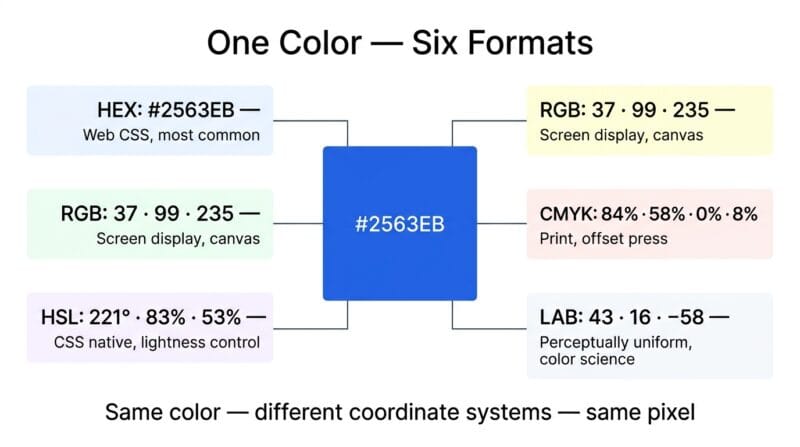
RGB has an important limitation for design work: its coordinate axes don’t map to perceptual properties. Increasing the red channel simultaneously increases brightness, shifts hue, and changes saturation — all at once. This makes RGB difficult to use for tasks like “make this color 20% lighter” or “shift this hue 30° warmer.” For those tasks, HSL and HSB are the right formats.
🟢 HSL vs HSB — Two Different Ways to Describe the Same Color Space
HSL (Hue, Saturation, Lightness) and HSB (Hue, Saturation, Brightness — also called HSV for Value) both use a 0–360° hue wheel, but their Lightness/Brightness axes work fundamentally differently. In HSL, a Lightness of 50% at any Saturation value gives the “pure” hue — the most vivid version of that color. At 0% Lightness you always get black; at 100% Lightness you always get white. This makes HSL well-suited to CSS because hsl(221, 83%, 53%) gives you direct control over whether a color reads as a tint (high lightness), a shade (low lightness), or a pure hue (50% lightness).
HSB places the “pure” hue at 100% Brightness, 100% Saturation. At 0% Brightness you always get black, regardless of hue or saturation. At 0% Saturation you get gray — the specific gray depends on Brightness. At 100% Brightness, 0% Saturation you get white. Design tools like Photoshop, Sketch, and Figma use HSB because it maps intuitively to how artists think about color — brightness controls overall lightness without affecting saturation, and saturation controls color intensity independently. CSS does not natively support HSB, so this tool converts it to the hsl() or rgb() equivalent for use in stylesheets. Our Color Studio Pro handles both HSL and HSB conversion in the same view, making it straightforward to translate values between design tool outputs and CSS inputs.
🟢 CMYK — Why Print Uses Subtraction Instead of Addition
CMYK (Cyan, Magenta, Yellow, Key/Black) is a subtractive color model — ink on paper absorbs (subtracts) light rather than emitting it. Cyan absorbs red, Magenta absorbs green, Yellow absorbs blue. Combining all three at full concentration theoretically produces black, but in practice produces a muddy dark brown, which is why printing adds a separate Key (black) ink channel. The conversion from RGB to CMYK uses this formula: C = 1 − (R/255), M = 1 − (G/255), Y = 1 − (B/255), then K = min(C, M, Y), with each remaining channel divided by (1 − K).
CMYK values are always device-dependent — the same CMYK values print differently on a digital press versus an offset lithography machine, on coated versus uncoated paper, and with different ink formulations. For web development, CMYK is useful primarily when communicating color specifications to print vendors or converting brand colors for print materials. The CMYK field in this tool gives a basic device-independent approximation suitable for specification purposes, but final print production should always use ICC color profile-managed conversions in professional prepress software.
🟡 CIE LAB Color Space — Perceptual Uniformity and Why It Matters
CIE LAB (L*a*b*, or just LAB) was developed by the International Commission on Illumination in 1976 specifically to be perceptually uniform. In a perceptually uniform color space, equal numerical distances correspond to equal perceived color differences — a property that RGB and HSL conspicuously lack. In RGB, changing the blue channel by 30 units produces a dramatically larger visual change in dark colors than in light ones. In LAB, a 10-unit L change looks approximately the same brightness shift regardless of the starting color.
LAB has three channels: L (Lightness) from 0 (black) to 100 (white), a (green to red axis) roughly from −128 to +127, and b (blue to yellow axis) roughly from −128 to +127. The conversion from RGB to LAB goes through XYZ color space — RGB is first linearised by reversing gamma compression (the (v + 0.055) / 1.055 ^ 2.4 formula), then multiplied by a 3×3 matrix to reach XYZ, then transformed to LAB using the cube-root function with the D65 white point as reference. LAB is the basis for the CIEDE2000 color difference formula used in professional color matching, print quality control, and accessibility research. CSS Color Level 4 introduces lab() as a native CSS function — browser support is growing and this color space will be increasingly important for web color work.
🟡 WCAG 2.1 Contrast Ratio Deep Dive — All Three Levels Explained
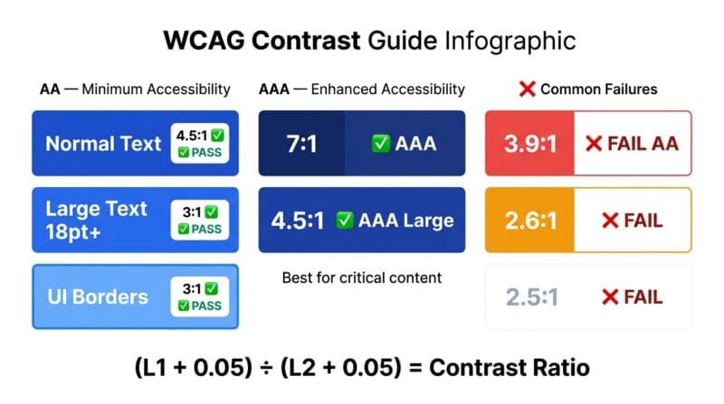
The WCAG 2.1 contrast ratio uses relative luminance — a measure of how much light a color reflects or emits, normalised to white = 1.0 and black = 0.0. The formula accounts for the non-linear relationship between RGB values and perceived brightness through gamma correction. Without gamma correction, a pixel with RGB (128, 128, 128) would appear to have 50% of white’s brightness — but perceptually it looks closer to 73% of white’s brightness because human vision is more sensitive to darker tones.
The three WCAG levels address different contexts. AA Normal Text (4.5:1) is the baseline requirement for body text, labels, and links. This ratio ensures text is readable by users with moderately low vision who do not use contrast enhancement tools. AA Large Text (3:1) applies a lower threshold to text at 18pt or larger in regular weight, or 14pt or larger in bold — larger text is easier to read at lower contrast because the letter shapes are more recognisable. This threshold also applies to UI component boundaries: the border of an input field, the outline of a button, or the divider between two panels needs 3:1 against adjacent colors. AAA Normal Text (7:1) is the enhanced requirement targeting users with severe low vision. It is not required for all content — the WCAG standard recognises that some content cannot always meet AAA — but should be the target for critical information like error messages, warnings, and legal disclosures.
🟢 Building an Accessible Color System from Scratch
An accessible color system starts with a primary hue and builds outward using lightness variation to create a scale with enough contrast between steps. The Tailwind CSS approach — 50 (very light), 100, 200, 300, 400, 500 (mid), 600, 700, 800, 900 (very dark) — gives 10 steps that cover the full range from near-white to near-black for any hue. The key constraint for accessibility: any color from 600–900 on the scale should pass 4.5:1 against white, and any color from 50–400 should pass 4.5:1 against black. This gives you six dark options for text on light backgrounds and four light options for text on dark backgrounds.
The practical workflow: pick your primary hue in HSL, set saturation to your brand level, then generate the 10-step scale by varying lightness from 95% (step 50) to 5% (step 900) in 10% increments. Check each step at the 600 boundary for white text contrast. Adjust saturation per step if needed — many design systems reduce saturation at the extremes to prevent colors from looking washed out (at high lightness) or muddy (at low lightness). Use the 🌈 Palette tab’s Tints & Shades section to generate this scale, then copy the CSS Variables to get your design token foundation. Check each level against the WCAG Contrast tab, and run the Color Blindness Simulator to verify the palette remains distinguishable for users with Deuteranopia — the most common form of color vision deficiency.
- 🔵 Never rely on color alone to convey information — always pair color with text, icons, or patterns. This addresses all types of color blindness simultaneously.
- 🟠 Error states are the most common color accessibility failure — red text on white at low saturation often fails AA. Use
#991b1b(contrast 6.3:1 on white) rather than#dc2626(3.9:1 — fails AA). - 🟣 Focus indicators need 3:1 contrast against adjacent colors — if your focus ring is the same color as the element background, it’s invisible to low-vision users and fails WCAG 2.1 Success Criterion 1.4.11.
Why does HSL show 50% lightness as the “pure” color but HSB shows it at 100% brightness?
The two models define their axes differently. In HSL, lightness is a symmetric measure: 0% is black, 100% is white, and 50% is the pure hue at maximum saturation. In HSB, brightness measures how much light the color emits relative to its maximum — 100% brightness means “as bright as this hue can be,” which at 100% saturation gives the pure hue. At 0% brightness both models give black, but the path from black to white is mapped differently. CSS uses HSL; design tools typically use HSB.
What causes the slight difference between calculated CMYK and what I see in Photoshop?
CMYK conversion is device-dependent by nature. This tool uses a simple device-independent formula (the ink coverage calculation) which gives a mathematically correct but profile-unaware result. Photoshop applies ICC color profiles that account for specific printing press characteristics, paper absorption, ink dot gain, and other physical variables. The numbers differ because they’re optimised for different purposes — this tool gives a universal specification; Photoshop gives a press-specific one.
What does the a* and b* channel in LAB actually represent visually?
The a* axis runs from green (negative values) to red (positive values). The b* axis runs from blue (negative values) to yellow (positive values). A color with a* = 0, b* = 0 is a neutral gray — no chromatic hue at all. Moving along a* shifts the hue from green through neutral to red. Moving along b* shifts it from blue through neutral to yellow. The L* channel controls lightness independently of chromaticity — you can lighten a color by increasing L* without changing its hue, which isn’t possible in RGB or even HSL with full accuracy.
Does passing WCAG AA contrast mean my color is accessible to everyone?
WCAG AA contrast addresses luminance-based visibility — it helps users with low vision, cataracts, and other conditions affecting overall light perception. It does not address color blindness, which is about distinguishing hues rather than brightness. A red and green at the same luminance level can pass WCAG AA contrast against white backgrounds while being completely indistinguishable to Deuteranopic users. Full accessibility requires contrast compliance plus color blindness testing plus not relying solely on color to convey meaning.
When should I use CSS custom properties versus Tailwind color classes?
CSS custom properties (--color-primary: #2563eb) are best when you need a color to be themeable at runtime — dark mode switches, user-configurable themes, or brand colors that might change without recompiling. Tailwind classes (text-blue-600) are best for utility-first development where design tokens are defined at build time and consistency across a component library matters more than runtime flexibility. Many projects combine both — define the scale as CSS variables, then reference them in a Tailwind config extension.
What is the WCAG requirement for focus ring visibility?
WCAG 2.1 Success Criterion 1.4.11 (Non-text Contrast) requires UI component boundaries — including focus indicators — to have at least 3:1 contrast against adjacent colors. WCAG 2.2 introduced SC 2.4.11 (Focus Appearance) requiring the focus indicator area to be at least the perimeter of the component and 3:1 contrast against both the unfocused and focused states. In practice: your focus ring should have 3:1 contrast against the background it appears on and should be at least 2px wide to remain visible at all zoom levels.
How does the Color Mixer interpolate between two colors?
The mixer uses linear RGB interpolation — each channel (R, G, B) is blended separately based on the ratio slider. At 50/50, the result is (R1 + R2) / 2 for each channel. This is the same method used by CSS color-mix() in the srgb color space. Linear RGB mixing can produce visually darker results at the midpoint when blending complementary colors — this is the “muddy middle” effect. For perceptually better gradients, LAB interpolation (as supported by color-mix(in lab) in CSS Color Level 5) avoids this effect, but most browsers currently default to sRGB interpolation.
Why do some mid-range colors fail WCAG AA against both white and black?
Colors in the medium luminance range — roughly lightness 35–65% in HSL depending on saturation — have a relative luminance close to the geometric mean of white and black. The contrast ratio against white (lighter than the color) and against black (darker than the color) are both moderate. No color can simultaneously achieve 4.5:1 against both white and black — the contrast formula means a color that gets closer to white automatically gets further from black. Mid-range colors are background-only candidates; use darker or lighter variants for text.
Is there a CSS syntax I can use for LAB colors directly in my stylesheet?
Yes. CSS Color Level 4 introduced the lab() function: color: lab(43 16 -58);. Chrome 111+, Safari 15+, and Firefox 113+ support it without prefixes. The syntax is lab(L a b) where L is 0–100, and a and b are roughly −128 to +128. For older browser support, use the @supports rule to fall back to a hex or rgb value. CSS Color Level 5 also introduces oklch() which many consider more intuitive than LAB for design work because its C (chroma) channel doesn’t create hue shifts when you adjust lightness.