Free CSS Box Shadow & Background Gradient Generator
Visually design beautiful CSS box shadows, inset shadows, and background gradients. Generate cross-browser CSS code instantly and 100% offline.

Table of Contents
CSS Visual Studio Pro
Design beautiful box shadows and gradients, and copy the CSS code instantly.
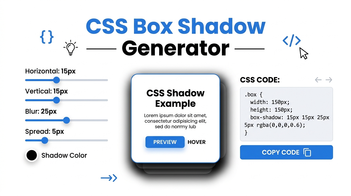
Adjust the Sliders
Use the intuitive UI sliders to tweak the X/Y offsets, blur radius, and spread to create the perfect 3D depth for your web elements.
Preview Instantly
Watch the preview box update in real-time. Switch between outer shadows, inner (inset) shadows, and beautiful background gradients.
Copy Cross-Browser Code
Click the copy button to grab the clean, cross-browser compatible CSS syntax, ready to be pasted directly into your stylesheet.
In the modern era of UI/UX design, flat interfaces have evolved into rich, deeply layered experiences. The strategic use of the CSS box-shadow property and dynamic background gradients is essential for establishing visual hierarchy on a webpage. However, writing the raw CSS syntax for complex shadows with multiple alpha-channel colors can be tedious and prone to syntax errors. Prime Tool Hub’s CSS Visual Studio Pro acts as your offline, browser-based laboratory, allowing you to intuitively design shadows and gradients with instant visual feedback.
Design Tip: The best modern UI shadows are barely noticeable. To achieve a premium “floating” card effect, set your blur radius high (above 20px), your spread to 0px, and drop your shadow opacity below 10% (0.1).
🟦 What is a CSS Box Shadow Generator with Background Gradient CSS?
A CSS box shadow generator is a visual web utility that translates graphical slider inputs into valid Cascading Style Sheets (CSS) code. Instead of manually typing box-shadow: 10px 10px 20px 0px rgba(0,0,0,0.15); and constantly refreshing your browser to see the result, our tool manipulates the Document Object Model (DOM) in real-time. This 100% client-side application generates cross-browser compatible code, including `-webkit-` and `-moz-` vendor prefixes, ensuring your designs look perfect on Chrome, Safari, and Firefox.
🟩 The Anatomy of a Perfect Box Shadow
To master UI depth, developers must understand the four primary numerical values that make up a standard CSS shadow declaration. Our tool provides precise range sliders for each of these crucial elements:
🔲 Horizontal & Vertical Offsets (X / Y)
The first two values dictate the shadow’s position relative to the element. A positive X value pushes the shadow to the right, while a positive Y value pushes it down. Simulating a light source originating from the top-left of the screen is the industry standard for user interfaces, which is why offsets are typically positive numbers.
🌫️ Blur Radius
The blur radius determines the softness of the shadow’s edge. A value of 0px creates a harsh, solid line (often used in brutalist or retro 8-bit web design). Higher values create a softer, more diffused shadow that makes the element appear as if it is floating higher off the background surface.
📏 Spread Radius
The spread radius expands or contracts the physical size of the shadow before the blur is applied. Negative spread values are a secret weapon among senior frontend developers—they allow you to create a shadow that is smaller than the parent element, resulting in an elegant, elevated aesthetic.
🟨 Background Gradient Generator
Flat colors can make a website feel stagnant. By switching to the Background Gradient tab, developers can seamlessly blend two HEX colors into a fluid linear-gradient or radial-gradient. The integrated angle slider allows you to direct the light flow exactly where you need it, instantly generating the required CSS background properties.
🟪 Fast, Secure, and 100% Offline
Unlike other design utilities that rely on heavy server-side processing or inject tracking cookies into your session, Prime Tool Hub’s CSS generator operates entirely via local JavaScript. This guarantees zero latency when dragging sliders and ensures absolute privacy. Once the page loads, you can disconnect from the internet and continue designing your CSS framework uninterrupted.
🟥 Frequently Asked Questions (FAQ)
🟩 What is an inset shadow?
An inset shadow applies the depth effect inside the element rather than outside. By toggling the “Inset Shadow” switch in our generator, you can create the illusion of a stamped, pressed, or sunken UI component—a core technique in Neumorphic design.
🟨 Are the generated CSS codes compatible with mobile browsers?
Yes. The output box automatically generates standard CSS3 syntax alongside legacy webkit prefixes. This guarantees your box shadows and gradients will render beautifully across iOS Safari, Android Chrome, and all desktop browsers.
Elevate your frontend development workflow today. Bookmark Prime Tool Hub and use the ultimate offline CSS Visual Studio to design stunning web interfaces without writing a single line of code manually! Read Full CSS Design Guide ▼